
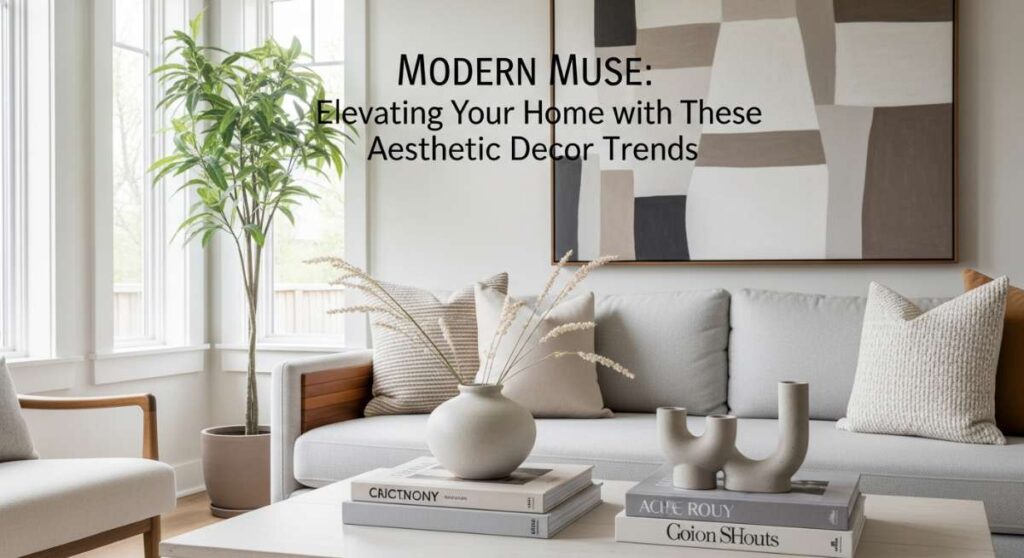
Have you ever walked into a room and felt an immediate sense of ‘rightness’? It’s that invisible exhale, the way the light catches a velvet pillow or how a specific shade of sage green seems to quiet the noise of the outside world. For years, I struggled to find that magic in my own home, treats my living space like a collection of items rather than a curated experience. I realized that my home wasn’t just where I slept; it was the canvas of my daily life, the place where my morning coffee tasted better and my evening thoughts felt safer.
Elevating your home isn’t about following every fleeting trend on social media; it’s about discovering the ‘Modern Muse’ within yourself. It’s about understanding the language of color and how it speaks to your soul. When we choose a palette, we aren’t just picking paint; we are setting the stage for memories. Whether you crave the high-fashion drama of a sophisticated lounge or the gentle embrace of a serene sanctuary, the secret lies in the intentional layering of hues, textures, and light.
Today, I’m pulling back the curtain on how to transform your living space into a masterpiece of aesthetic bliss. We’re going beyond the surface to explore the deep, sensory impact of decor. From mastering the 60-30-10 rule to layering cozy elements that make you never want to leave, let’s dive into the art of creating a home that feels as good as it looks. Get ready to fall in love with your four walls all over again.
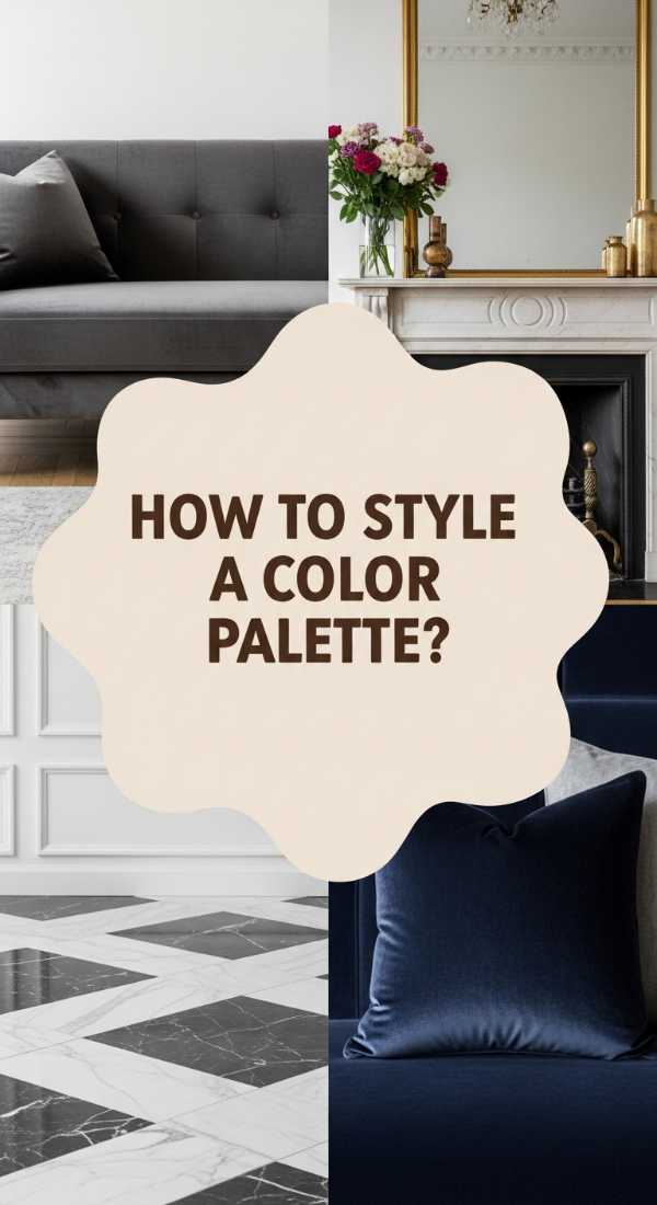
How to Master Room Decor Colors for a Harmonious Home
Why we love this
There is a profound, soulful satisfaction in a room where the colors sing in perfect harmony, creating a visual symphony that resonates through the entire house. We love this approach because it replaces chaos with a rhythmic flow, using soft transitions and grounded neutrals that feel like a warm hug. Imagine the scent of fresh eucalyptus lingering in the air while your eyes glide across walls the color of toasted almond and furniture in whispers of cloud grey. It transforms a house from a series of disconnected boxes into a cohesive narrative where every room feels like a continuation of a beautiful, peaceful story.
Essential Elements:
- Base neutral (Cream, Taupe, or Soft Grey)
- Secondary grounding hue (Warm Wood or Charcoal)
- Accent shade from the same color family
- Natural light filtering
- Matte finishes
How to make it
- Begin by auditing the natural light in your space; observe how the sun moves from east to west to determine if your base should be a cool or warm undertone. If the room is north-facing, opt for ‘warmer’ neutrals to prevent a sterile, blueish cast.
- Apply the 60-30-10 rule: use your base neutral for 60% of the space (walls and rugs), a secondary color for 30% (upholstery), and an accent for 10% (decor). This creates a ‘simmer’ effect where no single element boils over and overwhelms the senses.
- Select a ‘bridge’ element, such as a piece of art or a multi-tonal rug, that contains all three chosen colors to visually lock the palette together.
- Check the ‘visual doneness’ by stepping back and squinting; if one color jumps out too sharply, soften it with a texture like a linen throw to diffuse the light reflection.
- Finalize the mood by layering in lighting with a temperature of 2700K to 3000K, ensuring the colors remain true to their swatches even after the sun sets.
How to Style a Living Room Decor Color Palette for Instant Sophistication
Why we love this
Sophistication is an art of restraint and luxury, and we are obsessed with how a well-chosen palette can make even a modest living room feel like a high-end boutique hotel. This look is all about the ‘quiet luxury’ of deep navy, rich forest greens, or the timeless pairing of black and gold. The air feels crisp and intentional in these spaces, often carrying the faint, elegant aroma of sandalwood and leather. It’s about the tactile joy of running your hand over a cold marble surface or the weight of a heavy, bespoke curtain that drapes perfectly against the floor, signaling that every detail was chosen with absolute care.
Essential Elements:
- Deep, saturated jewel tones
- Metallic accents (Polished Brass or Matte Black)
- High-quality textiles (Velvet, Silk, or Leather)
- Statement lighting fixtures
- Architectural focal points
How to make it
- Identify your ‘anchor’ piece—usually a sofa or a large-scale artwork—and select a rich, saturated hue like midnight blue or espresso to serve as the sophisticated heartbeat of the room.
- Incorporate metallic ‘high-lights’ through hardware or tray accents; treat these like jewelry for the room, adding a reflective ‘spark’ that keeps the darker colors from feeling heavy or flat.
- Layer textures by mixing matte wall paint with high-sheen fabrics; this contrast creates ‘visual seasoning’ that adds depth and prevents the monochromatic look from feeling one-dimensional.
- Style your shelving using the ‘pyramid technique,’ grouping items of varying heights in your chosen palette to guide the eye upward, creating a sense of grandeur and height.
- Ensure the ‘curing’ of the room’s vibe by adding one ‘unexpected’ element—a pop of burnt orange or a vintage gold frame—to break the perfection and add a layer of lived-in designer mystery.
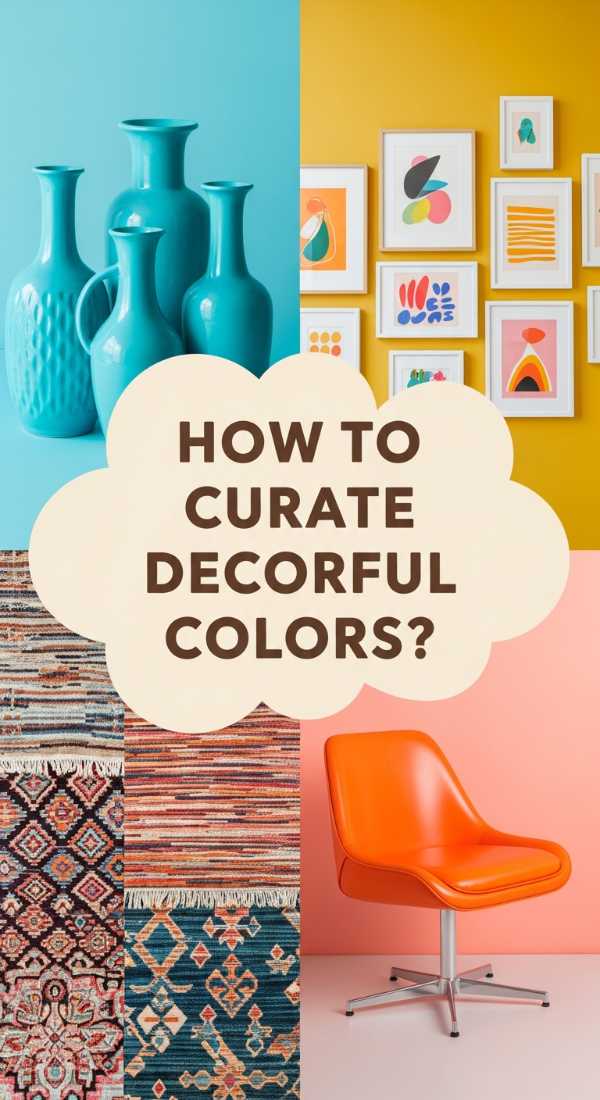
How to Curate Decor Colorful Accents for a Vibrant Vibe
Why we love this
Sometimes the soul needs a jolt of pure energy, and we adore the way vibrant accents can turn a dull space into a playground for the imagination. This isn’t about clutter; it’s about the strategic placement of ‘joy triggers’—a sunshine-yellow vase, a fuchsia throw, or a gallery wall bursting with primary colors. It feels like a breath of fresh air on a spring morning, citrusy and bright. The texture is all about variety, from smooth glazed ceramics to the rough, handmade feel of woven baskets, creating a tactile environment that encourages exploration and sparks conversation at every turn.
Essential Elements:
- Neutral backdrop (White or Light Grey)
- Bold accent colors (Teal, Mustard, Coral)
- Geometric patterns
- Greenery and botanical elements
- Eclectic art pieces
How to make it
- Establish a ‘canvas’ by keeping your largest surfaces neutral; this allows your vibrant accents to ‘pop’ without competing for the viewer’s attention.
- Choose a ‘lead’ accent color and repeat it at least three times in the room at different heights—for example, a cushion on the chair, a book on the coffee table, and a pot on the mantle.
- Introduce a ‘complementary’ secondary accent to create a vibrant tension; if your lead is blue, add a dash of orange to make both colors appear more vivid and electric.
- Balance the ‘heat’ of bright colors with natural wood or indoor plants; the organic green acts as a ‘coolant’ that keeps the vibrancy from becoming visually exhausting.
- Arrange the accents in ‘triplets’ of varying textures to ensure the space feels curated rather than cluttered, giving each piece enough ‘breathing room’ to shine individually.
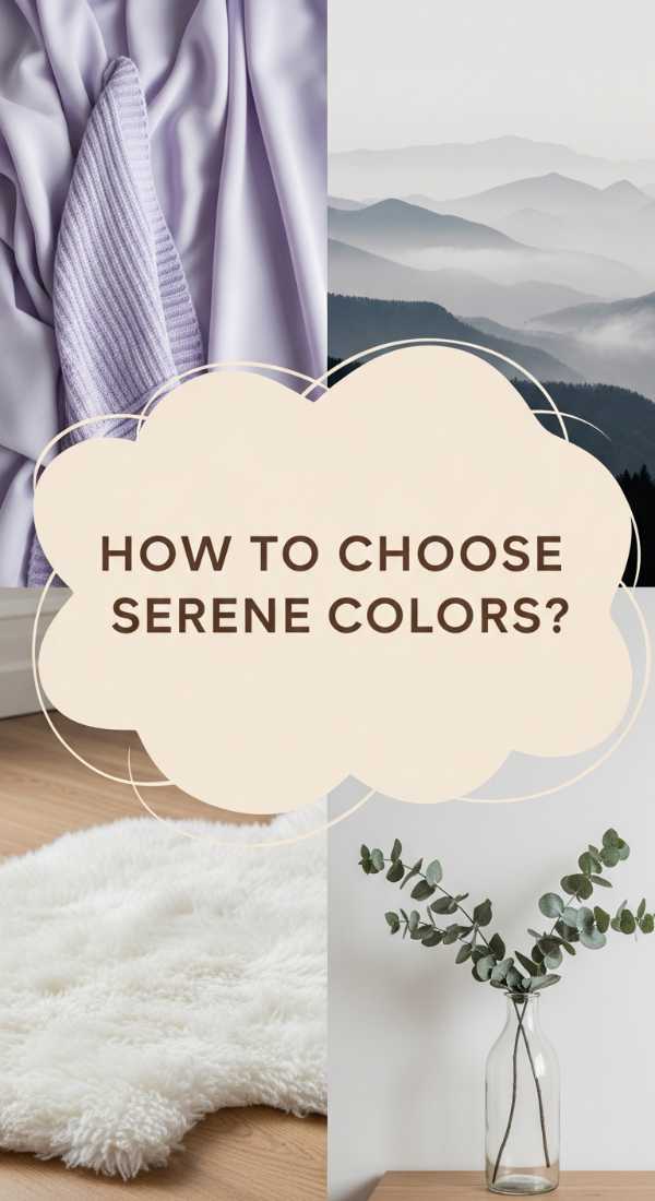
How to Choose Living Room Decor Colors for a Serene Sanctuary
Why we love this
The world is loud, which is why we are deeply enamored with the concept of the ‘Serene Sanctuary’—a space that feels like a quiet morning at a luxury spa. This aesthetic leans heavily into soft washes of color: seafoam glass, pale lavender, and the softest oatmeal. The textures are ethereal and light, like cotton muslin and soft sheepskin, inviting you to kick off your shoes and sink into the silence. It’s a sensory experience of soft-focus edges and the gentle, calming scent of lavender and white tea, where every color choice is a deliberate step toward mental clarity and physical relaxation.
Essential Elements:
- Soft, cool-toned pastels
- Bleached woods
- Translucent materials (Glass, Acrylic)
- Natural fibers (Linen, Cotton)
- Minimalist clutter-free surfaces
How to make it
- Select a base color that mimics the natural world on a misty day—think pale greys or soft, desaturated blues—to lower the visual ‘volume’ of the room immediately.
- Eliminate high-contrast transitions; instead of black hardware, opt for brushed nickel or white porcelain to keep the eye moving smoothly without any jarring interruptions.
- Layer sheer window treatments that allow light to be ‘sifted’ and softened, creating a glowing, ethereal atmosphere that feels separated from the outside world.
- Incorporate ‘soft-touch’ surfaces; replace sharp-edged coffee tables with rounded ottomans in a pale fabric to emphasize comfort and safety in the design.
- Monitor the ‘doneness’ of the sanctuary by removing one unnecessary decorative object from every surface; in a serene space, the ’empty’ space is just as important as the colored space.
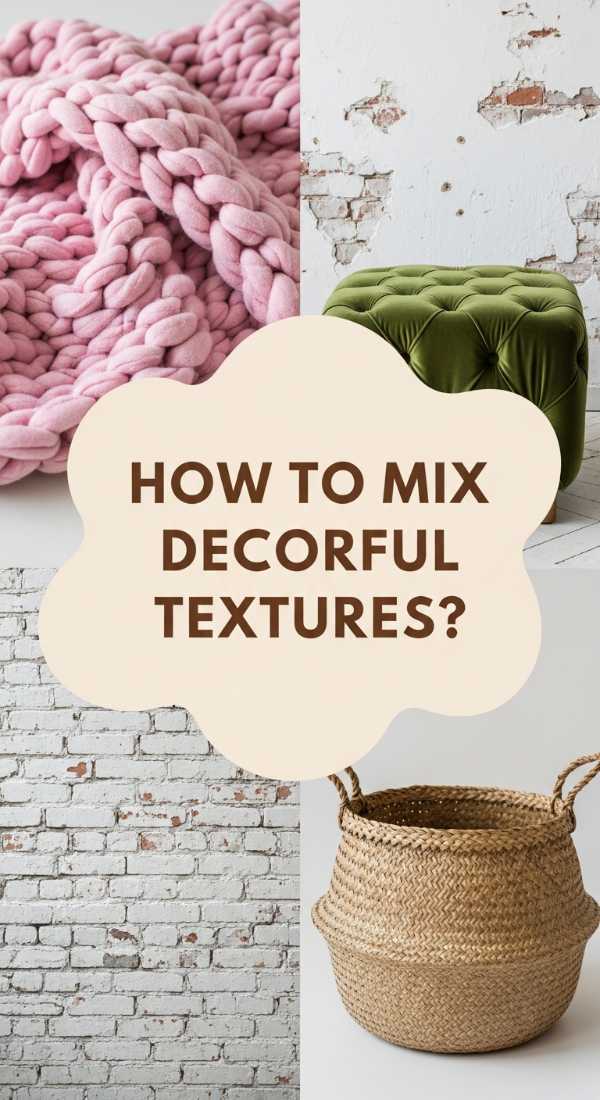
How to Mix Living Room Decor Colorful Textures for Maximum Impact
Why we love this
Texture is the ‘hidden ingredient’ of home decor that we simply cannot get enough of; it’s what makes a color feel three-dimensional and alive. When you mix a glossy emerald ceramic lamp with a matte emerald velvet sofa, the color takes on a life of its own, shifting with the light. We love the sensory richness of this approach—the way a chunky wool rug feels against bare feet compared to the smooth, cool touch of a silk pillow. It creates a space that feels curated over time, full of stories and ‘tactile layers’ that beg to be touched and explored, much like the complex flavors of a gourmet meal.
Essential Elements:
- Contrasting materials (Rough vs. Smooth)
- Light-reflective surfaces
- Varied pile heights in rugs
- Mixed fabric weights
- Natural elements (Stone, Wood, Metal)
How to make it
- Pick one core color to act as your ‘flavor base’ and collect 4-5 different items in that exact shade, but in entirely different materials—such as wool, metal, glass, and wood.
- Apply the ‘Rule of Opposites’ by placing a very rough texture next to a very smooth one; for example, place a rustic wooden tray on top of a sleek leather ottoman to accentuate both finishes.
- Incorporate a ‘high-pile’ element like a shag rug or a mohair throw to absorb sound and add a layer of physical and visual softness to the ‘foundation’ of the room.
- Use ‘reflective seasoning’—mirrors or metallic frames—to bounce light off the various textures, highlighting the ‘grain’ and ‘weave’ of your fabrics during the golden hour.
- Check the ‘balance’ by walking through the room; a well-textured space should feel visually ‘heavy’ at the bottom and ‘light’ at the top, grounding the room while keeping the ceiling airy.
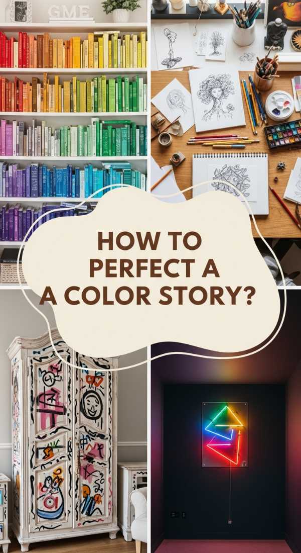
How to Perfect Your Room Decor Color Story for Personal Expression
Why we love this
There is nothing more beautiful than a home that tells the story of the person who lives there, and we love the ‘Color Story’ method for its sheer authenticity. This isn’t about what’s in a catalog; it’s about the deep terracotta that reminds you of a trip to Italy, or the specific shade of blush that mimics your grandmother’s peonies. It feels personal, warm, and wonderfully ‘undone.’ The aroma here is often familiar and nostalgic—perhaps the scent of old books and fresh coffee—while the textures are a mix of vintage finds and modern comforts, creating a layered, soulful expression of your unique journey through life.
Essential Elements:
- A ‘hero’ color inspired by a personal memory
- Heirloom or vintage pieces
- Personal photography or art
- A mix of high and low-end decor
- Handcrafted elements
How to make it
- Start with an ‘inspiration object’—a scarf, a postcard, or a piece of jewelry—and extract a color palette of 3-5 hues that represent the emotions of that specific memory.
- Map these colors across the room by assigning the most dominant ‘memory color’ to the largest area, ensuring the space feels anchored in your personal narrative.
- Introduce ‘heirloom ingredients’ by refurbishing an old piece of furniture with a fresh coat of paint from your palette, blending the past with your current aesthetic.
- Curate a ‘story wall’ where art and objects in your chosen color story are arranged in a gallery style, using consistent framing to ‘braid’ different eras together.
- Taste-test the ’emotional temperature’ of the room; if it feels too ‘staged,’ add something slightly ‘off-palette’ or quirky to represent the complexity of your personality and make it feel authentic.
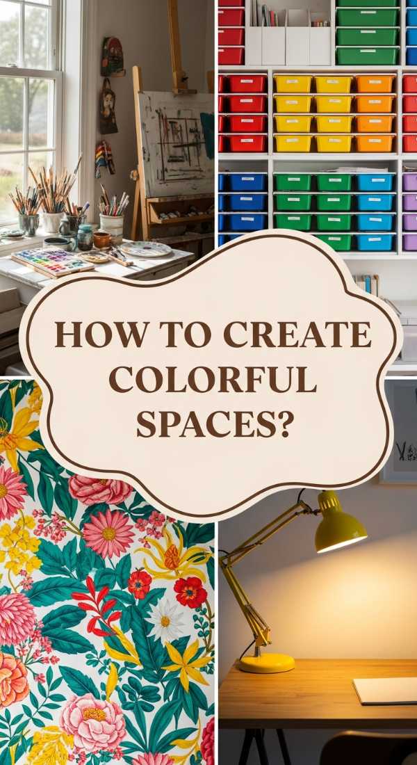
How to Create a Room Decor Colorful Space for Inspired Living
Why we love this
We believe that your environment directly impacts your creativity, and an inspired space is one that uses color to stimulate the mind and spark new ideas. We love the energy of unexpected color pairings like plum and mustard, or teal and copper. These spaces feel alive and ‘kinetic,’ often filled with the sound of music and the tactile presence of art supplies or musical instruments. It’s a sensory feast of bold patterns and rich, saturated colors that challenge the status quo, making every morning feel like a fresh opportunity to create something extraordinary in a room that radiates ambition and joy.
Essential Elements:
- High-contrast color pairings
- Functional art (Design-forward tools)
- Creative zoning (Nooks for thinking)
- Dynamic patterns (Stripes, Abstracts)
- Maximalist decor touches
How to make it
- Define ‘creative zones’ within the room using rugs or wall color blocks to signal to your brain that a specific area is for brainstorming or creation.
- Utilize ‘color-blocking’ on the walls to create a geometric, high-energy backdrop that breaks the traditional ‘one-color-per-room’ rule.
- Incorporate ‘active decor’ like open shelving filled with colorful books or inspiration boards that can be easily updated, keeping the ‘creative flow’ moving.
- Balance the ‘visual noise’ by using black or white as a ‘cleanser’ between bold colors, preventing the space from becoming a chaotic distraction rather than an inspiration.
- Add a ‘tactile stimulus’ like a velvet-lined desk chair or a textured wall hanging to engage your sense of touch while you work, grounding your thoughts in the physical space.
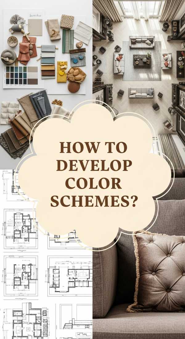
How to Develop Decor Color Schemes for a Designer Look
Why we love this
The ‘Designer Look’ is that elusive, polished finish that feels effortlessly expensive and perfectly composed. We love this style for its use of tonal variations—layering different shades of the same color to create a ‘monochromatic luxury.’ It’s the visual equivalent of a cashmere sweater; it’s soft, sophisticated, and incredibly deep. The air in these rooms feels ‘expensive,’ often carrying notes of bergamot and cedar. The textures are meticulous, from the sharp pleat of a curtain to the perfectly ‘chopped’ pillow, creating a sense of order and high-fashion elegance that turns everyday living into a cinematic experience.
Essential Elements:
- Tonal color layering (Ombre effects)
- Symmetry in furniture placement
- Custom window treatments
- Large-scale decor pieces
- High-end finishes (Brass, Marble, Oak)
How to make it
- Select one ‘base note’ color and source paint, fabrics, and accessories in varying ‘tones’—some lighter, some darker—to create a sophisticated, layered monochromatic ‘glaze’ over the room.
- Focus on ‘scale’ by choosing a few oversized items—like a massive floor lamp or a giant mirror—rather than many small items, which gives the room a confident, ‘architectural’ presence.
- Implement ‘designer symmetry’ by mirroring layouts (e.g., two identical chairs facing a sofa) to create a sense of formal ‘plating’ and visual balance that looks professional.
- Ensure the ‘edges’ are crisp; use molding or trim in a slightly darker shade than the walls to ‘frame’ the color and give the room a bespoke, tailored finish.
- Add the ‘final garnish’—a single, high-quality floral arrangement or a designer coffee table book—to signal that the space is fully ‘set’ and ready for presentation.
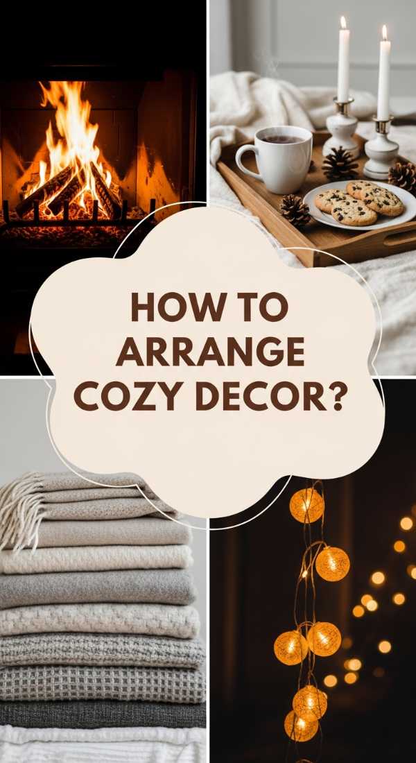
How to Arrange Living Room Decor Cozy Elements for Pure Comfort
Why we love this
There is nothing quite like the ‘Cozy Element’ trend for making a house feel like a true home. We love the way it prioritizes the ‘felt experience’—the warmth of a chunky knit blanket, the soft flicker of amber-toned candles, and the deep, inviting sink of a down-filled cushion. It’s like a warm bowl of soup for the soul. The color palette is often ‘edible’ and earthy: chocolate browns, creamy vanillas, and spicy terracottas. This is a space where the aroma of cinnamon and warm wood smoke lingers, and the textures are designed for lounging, naps, and long, intimate conversations on a rainy afternoon.
Essential Elements:
- Soft, warm-toned lighting
- Chunky knit textiles
- Plush floor pillows
- Natural wood accents
- Ambient ‘glow’ (Candles, Fireplace)
How to make it
- Focus on the ‘floor up’ by layering a soft jute rug with a plush sheepskin or faux-fur rug on top to create a ‘base layer’ of warmth and softness for the feet.
- Swap out cool LED bulbs for ‘warm’ filaments (2200K) to create a golden, sunset-like ‘inner glow’ that instantly makes the color scheme feel richer and more inviting.
- ‘Over-provision’ the seating by adding twice as many pillows and throws as you think you need, layering them in a ‘nesting’ pattern to invite immediate relaxation.
- Incorporate ‘scent-scaping’ by placing amber or vanilla-scented elements near heat sources, allowing the fragrance to ‘bloom’ and fill the room as part of the decor.
- Arrange furniture in ‘conversational clusters’ that face inward toward a soft focal point, like a fireplace or a coffee table, to maximize the feeling of ‘closeness’ and safety.
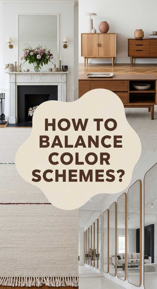
How to Balance Living Room Decor Color Schemes for Aesthetic Bliss
[IMAGE_10]
Why we love this
Aesthetic bliss is found in the perfect ‘equilibrium’ between light and dark, warm and cool, and old and new. We love the way a balanced room feels ‘complete’ and effortless, like a masterfully composed photograph. It’s the visual exhale when a bold, dark wall is perfectly countered by a soft, light-filtering linen curtain and a pops of metallic shine. This approach is about the sensory ‘sweet spot’—where the eyes are stimulated but not strained, and the body feels grounded yet light. It’s a harmonious blend of textures like smooth plaster and rough linen that creates a timeless, blissful environment for modern living.
Essential Elements:
- Contrast (Light vs. Dark)
- Visual Weight distribution
- A mix of ‘warm’ and ‘cool’ tones
- Negative space (The ‘Empty’ spots)
- Rhythm and repetition
How to make it
- Evaluate the ‘visual weight’ of your room; if all your dark, heavy furniture is on one side, ‘counter-balance’ it by adding a large piece of art or a dark-painted feature wall on the opposite side.
- Mix ‘temperature’ by introducing cool blue accents into a warm beige room; this ‘culinary’ balance of temperatures prevents the space from feeling too ‘hot’ or ‘chilly.’
- Master the ‘Negative Space’ technique—leave at least 20% of your walls and surfaces empty to act as a ‘palate cleanser’ for the eyes, allowing the color schemes to truly breathe.
- Repeat your accent colors in a ‘rhythmic pattern’ throughout the space (high, medium, and low levels) to create a visual ‘beat’ that the eye can follow effortlessly.
- Finalize the ‘bliss’ by checking the room’s ‘vibration’ at different times of day; a balanced scheme should feel equally beautiful in the harsh light of noon and the soft shadows of twilight.
Conclusion: Your Home, Your Masterpiece
Creating a home that reflects your aesthetic isn’t just about the objects you buy, but the intention you pour into every corner. By mastering these color schemes and layering techniques, you’ve turned your living space into a living, breathing muse. Remember, decor is an evolving journey—don’t be afraid to tweak the ‘seasoning’ of your rooms as you grow and change. Your home is now a sanctuary of balance, a hub of inspiration, and a true reflection of your most sophisticated self. Happy styling!