
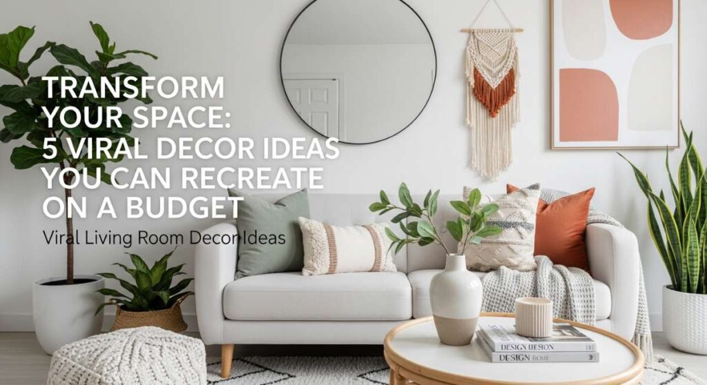
Transform Your Space: 5 Viral Decor Ideas You Can Recreate on a Budget
Have you ever scrolled through your feed and felt a sudden wave of ‘home envy’ while looking at those perfectly curated living rooms? We’ve all been there—clutching a lukewarm coffee, looking at our own mismatched pillows, and wondering how on earth people make their homes look like a professional set without spending a fortune. The truth is, a beautiful home isn’t about the price tag; it’s about the feeling you cultivate within those four walls.
Your living room is more than just a place to sit; it is the heart of your personal sanctuary, the backdrop for late-night chats, and the canvas for your creative soul. Today, we are diving deep into the viral trends that are taking over the internet, breaking them down into simple, budget-friendly steps. Let’s turn that ‘one day’ into ‘today’ and breathe new life into your favorite space with these high-impact, low-cost decor hacks.
How to Create a Cozy Sanctuary for Pure Relaxation
Why we love this
There is nothing quite like the feeling of sinking into a room that feels like a warm hug after a grueling day. We love this sanctuary vibe because it prioritizes tactile comfort—the fuzzy grit of a boucle chair, the weight of a chunky knit throw, and the soft, dancing glow of a sandalwood-scented candle. It creates an olfactory and visual escape that melts away stress, making your home feel less like a building and more like a gentle retreat for the soul.
Essential Elements:
- Chunky knit wool blankets
- Warm-toned LED string lights or amber bulbs
- Sandalwood or lavender essential oils
- Plush velvet floor cushions
- Soft linen window treatments
How to make it
- Begin by stripping the room of any harsh, ‘cold’ elements; replace overhead fluorescent lighting with warm-toned lamps at various heights to create a layered glow.
- Identify your ‘nesting zone,’ usually the sofa or a corner chair, and layer at least three different textures—think a cotton base, a wool throw, and a silk pillow—to create visual and physical depth.
- Incorporate natural elements like dried eucalyptus or a small indoor water feature to introduce a calming ‘outdoor’ aroma and soundscape.
- Ensure the floor is soft underfoot by layering a smaller faux-fur rug over your existing carpet or hardwood for that ultimate ‘walking on clouds’ sensation.
- Finalize the ambiance by setting your diffuser to a low, consistent mist, ensuring the scent lingers without overpowering the senses.
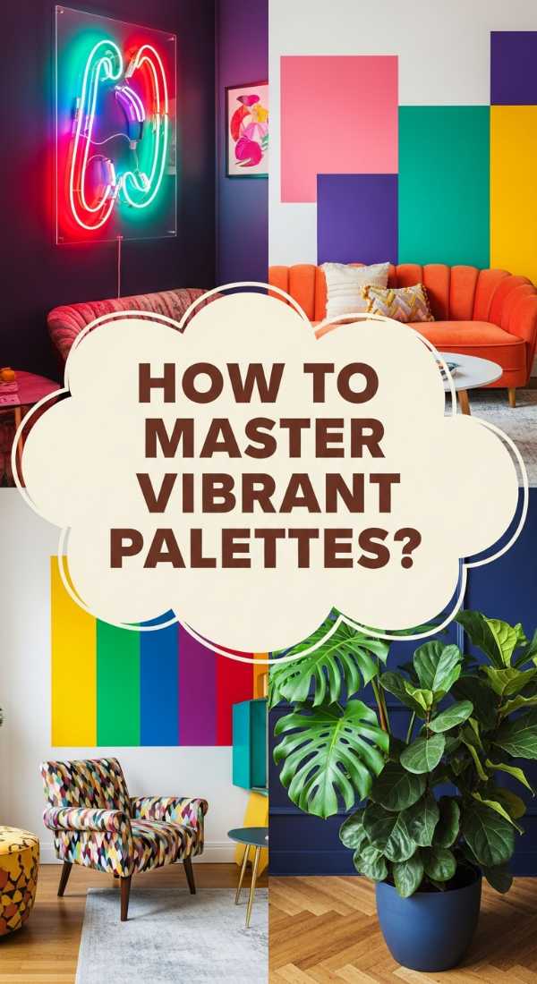
How to Master Vibrant Palettes for Energetic Living Spaces
Why we love this
Vibrant palettes are the ultimate ‘dopamine decor’ choice, instantly lifting your mood the moment you walk through the door. This approach is all about the ‘flavor’ of the room—the citrusy zing of a lemon-yellow accent wall or the electric pop of a turquoise vase. We love how these colors energize the spirit, stimulating conversation and creativity while making the space feel alive with a rhythmic, pulsing energy that is impossible to ignore.
Essential Elements:
- Bold citrus-toned paint or wallpaper
- Abstract colorful wall art
- Multi-colored braided rugs
- Neon sign accents
- Brightly glazed ceramic pots
How to make it
- Select one ‘anchor’ vibrant color that resonates with your energy level, such as a burnt orange or a deep fuchsia, and apply it to a single focal point.
- Balance the high-intensity color by using ‘cooling’ neutrals like crisp white or soft grey on the larger surface areas to prevent visual fatigue.
- Introduce secondary pops of color through small, easily swappable items like coffee table books or patterned coasters to create a cohesive ‘color story.’
- Position your vibrant pieces near natural light sources; the sun will ‘cook’ the colors, making them appear more saturated and luminous throughout the day.
- Review the room from the doorway to ensure the eye moves fluidly from one color pop to the next, creating a sense of intentional, energetic flow.
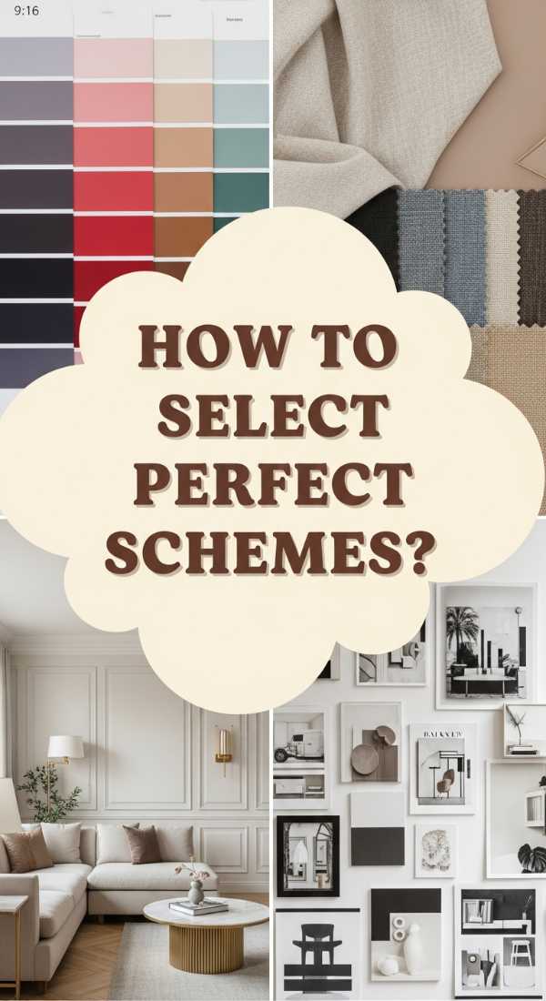
How to Select Perfect Color Schemes for Sophisticated Interiors
Why we love this
Sophistication is found in the subtle ‘notes’ of a room—the deep, musky tones of charcoal paired with the crispness of cream. We love this because it feels like a high-end hotel suite; it smells of expensive leather and polished wood, even on a budget. It’s a timeless aesthetic that relies on balance and ‘visual weight,’ providing a sense of order and quiet luxury that makes every guest feel like they’ve stepped into a curated gallery.
Essential Elements:
- Monochromatic paint swatches
- Metallic accents (brass or matte black)
- Structured furniture silhouettes
- High-contrast art pieces
- Luxe textures like marble or dark oak
How to make it
- Choose a base palette of three varying shades of the same color family (e.g., light grey, charcoal, and slate) to create an expensive-looking monochromatic depth.
- Apply the darkest shade to the lowest parts of the room (rugs, furniture legs) to ‘ground’ the space, while keeping the ceiling and upper walls light to maintain height.
- Incorporate metallic finishes in small doses—think drawer pulls or picture frames—to catch the light and add a ‘shimmer’ of high-end quality.
- Use symmetry to reinforce the sophistication; place matching lamps or identical cushions on either side of the sofa to create a ‘balanced’ visual ‘recipe.’
- Ensure every item has ‘breathing room’ around it; sophistication thrives on a lack of clutter, allowing each elegant piece to speak for itself.
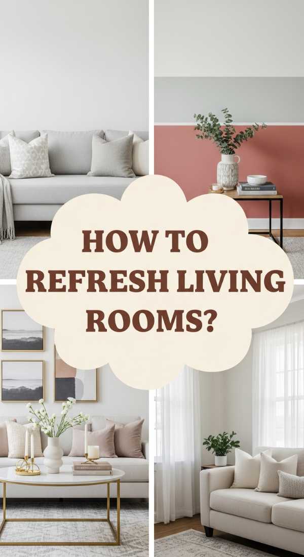
How to Refresh Your Living Room Palette for a Modern Look
Why we love this
A modern refresh is like a breath of cool, mountain air for a stagnant home. We love the crisp, clean textures and the subtle aroma of fresh cedar that often accompanies a modern update. It’s about stripping away the ‘dust’ of old trends and embracing a palette that feels current—think sage greens, muted clays, and soft greys. This look is incredibly satisfying because it feels organized, functional, and effortlessly stylish without trying too hard.
Essential Elements:
- Matte finish paints
- Minimalist floating shelves
- Geometric patterned textiles
- Large-leaf green plants (like Monstera)
- Sleek, handle-less storage
How to make it
- Identify ‘dated’ elements like heavy floral curtains or dark wood trim and swap them for lighter, matte-finish alternatives that reflect modern tastes.
- Choose a ‘hero’ neutral, like ‘greige’ or ‘bone,’ and apply it to the walls to create a clean, expansive canvas that feels immediately updated.
- Introduce modern texture through ‘low-profile’ items like flat-weave rugs or matte ceramic vases that don’t take up much visual space.
- Incorporate organic shapes, like a round mirror or an arched floor lamp, to soften the ‘hard’ lines of modern furniture and create a more inviting ‘flavor.’
- Maintain the modern ‘freshness’ by rotating your decor seasonally, keeping only the most functional and visually pleasing items on display.
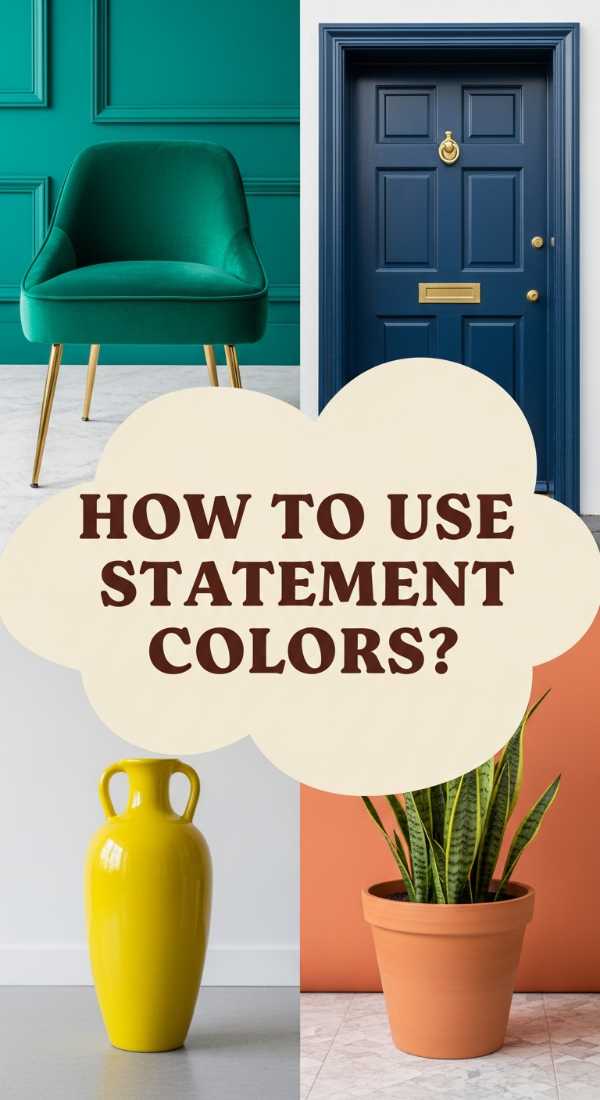
How to Use Statement Colors for Instant Visual Impact
Why we love this
Statement colors are the bold ‘spices’ of the interior design world. We love the dramatic ‘hit’ of a navy blue wall or a velvet emerald sofa because it creates an immediate conversation starter. It’s a sensory feast—the richness of the pigment feels like it has a ‘texture’ of its own, filling the room with a sense of confidence and personality. It’s the easiest way to make a big impact without changing every single piece of furniture you own.
Essential Elements:
- Deep jewel-toned paint (Emerald, Navy, Plum)
- Oversized statement art
- Contrasting throw pillows
- Strategic accent lighting
- Bold patterned rugs
How to make it
- Select a single wall or a large piece of furniture to be your ‘statement’ piece; this will be the ‘heart’ of your design’s visual flavor.
- Apply the color in a high-quality, matte or eggshell finish to ensure the pigment looks deep and rich rather than shiny and ‘cheap.’
- Surround the statement color with ‘quiet’ companions—natural woods, whites, or tans—to let the main color truly ‘sing’ without competition.
- Use ‘micro-accents’ of the same statement color in other parts of the room (like a single candle or a book spine) to tie the whole ‘recipe’ together.
- Adjust your lighting to highlight the statement area; use a spotlight or a well-placed floor lamp to draw the eye directly to your bold choice.
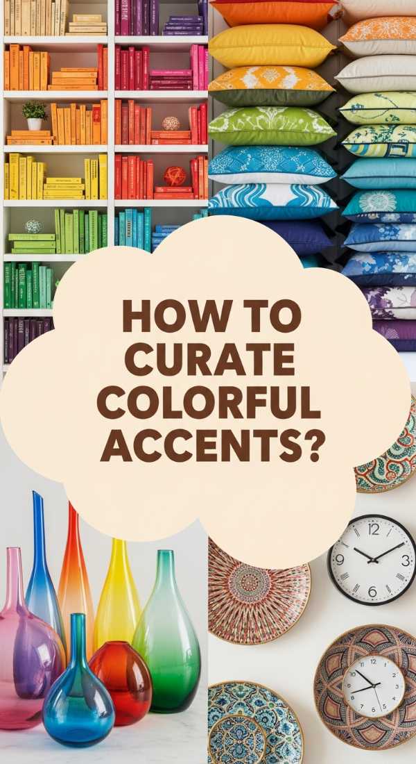
How to Curate Colorful Accents for a Joyful Home
Why we love this
There is a special kind of magic in the small details. We love curated accents because they allow you to ‘taste’ different trends without committing to a full renovation. The scent of fresh flowers in a bright pink vase, the soft touch of a yellow tasseled pillow, and the sight of a rainbow-spine bookshelf all contribute to a ‘joyful’ home. It’s a playful, low-stakes way to express yourself and keep your space feeling lighthearted and fun.
Essential Elements:
- Multi-colored throw pillows and blankets
- Eclectic glass vases
- Colorful coffee table books
- Assorted floral arrangements
- Small, vibrant tabletop sculptures
How to make it
- Start with a ‘clean’ base, like a neutral sofa or shelf, and treat it as a blank plate for your colorful ‘toppings.’
- Group accents in ‘trios’ using varying heights and textures to create a visually interesting ‘cluster’ that feels intentional rather than cluttered.
- Follow a specific ‘color family’ for your accents (e.g., pastels or primary colors) to ensure the joy feels organized and cohesive.
- Integrate living color through plants and flowers; the natural green of a fern ‘seasons’ the other colors, making them pop even more.
- Step back frequently during the ‘plating’ process to ensure the colors are distributed evenly throughout the room so no single corner feels ‘heavy.’
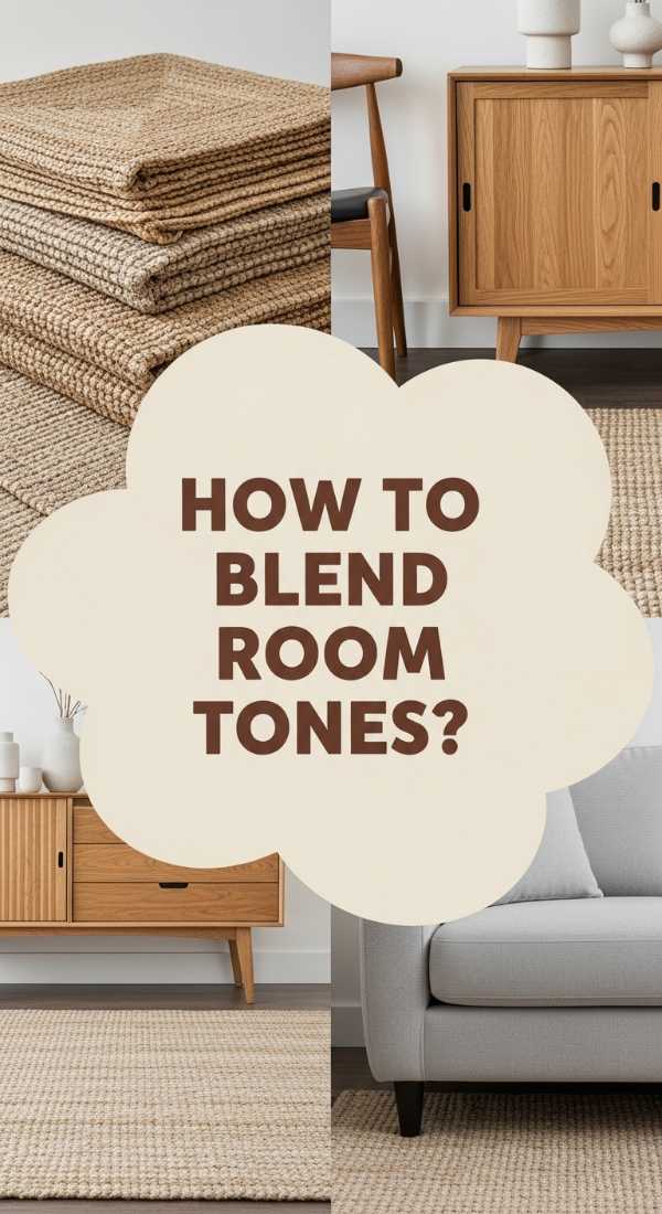
How to Blend Living Room Tones for Harmonious Design
Why we love this
A harmonious design is like a perfectly balanced meal—every note complements the other. We love the ‘blended’ look because it creates a sense of peace and flow. Imagine the scent of clean laundry and the soft feel of cotton; that is what harmony feels like. By blending tones rather than contrasting them, you create a space that feels expansive and calm, where the eye can rest easily on any surface without being ‘jolted’ by a harsh change.
Essential Elements:
- Tone-on-tone fabric samples
- Natural wood finishes
- Woven textures (rattan, jute)
- Soft, diffused lighting
- Gradient-style wall art
How to make it
- Select a ‘mother color’ (like a soft tan or misty blue) and find three to four shades that are just a ‘pinch’ lighter or darker than the original.
- Layer these shades throughout the room, using the darkest tones for the base (rugs) and the lightest tones for the ‘top’ (ceiling and light fixtures).
- Introduce ‘bridge’ textures like a woven jute rug that contains multiple shades of your palette to help transition the eye between different areas.
- Avoid ‘hard’ lines by choosing furniture with rounded edges and soft fabrics, which help the tones ‘bleed’ into one another more naturally.
- Check the room’s ‘temperature’ by ensuring you have a mix of warm and cool versions of your chosen tone to prevent the room from feeling ‘flat.’
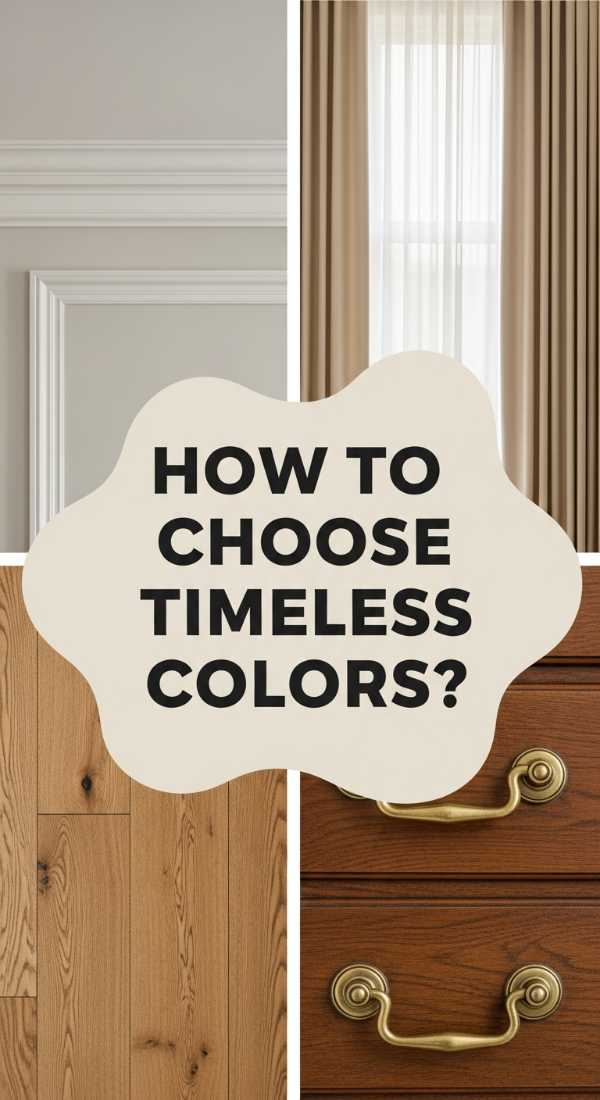
How to Choose Timeless Decor Colors for Every Room
Why we love this
Timeless colors are the ‘comfort food’ of home decor. We love shades like navy, forest green, and creamy white because they never go out of style and they always feel ‘right.’ They carry a certain ‘aroma’ of heritage and stability. These colors provide a reliable foundation that you can build upon for years, allowing you to change your style ‘garnish’ while the ‘main course’ remains classic and beautiful.
Essential Elements:
- Classic Navy or Forest Green paint
- Cream or Beige upholstery
- Solid wood furniture
- Traditional patterns (stripes or herringbone)
- Brass or copper hardware
How to make it
- Focus on the ‘bones’ of the room—walls and large furniture—and dress them in colors that have been popular for decades (e.g., White Dove or Navy Blue).
- Invest in quality ‘base’ materials like a solid oak coffee table or a linen sofa that will age beautifully and ‘flavor’ the room over time.
- Apply the ’80/20′ rule: keep 80% of the room in timeless colors and reserve 20% for ‘trendy’ accents that can be swapped out as the ‘seasons’ change.
- Use classic patterns like a subtle stripe or a small-scale plaid in your textiles to add visual interest without dating the space.
- Finish with ‘legacy’ lighting—think a traditional chandelier or a library-style floor lamp—to cement the timeless ‘recipe’ of the room.
How to Design a Colorful Living Space that Inspires Creativity

Why we love this
A creative space should feel like a ‘spark.’ We love using eclectic colors and shapes because they stimulate the brain and encourage ‘out of the box’ thinking. It’s a sensory playground—the smell of fresh ink, the sight of a gallery wall, and the feel of different fabrics under your hands. It’s a room that doesn’t follow the rules, allowing you to ‘cook’ up your own unique style that is a true reflection of your inner artist.
Essential Elements:
- Gallery wall with varied frames
- Mismatched (but curated) furniture
- Bright, multi-tonal rugs
- Creative ‘stations’ (a desk or a reading nook)
- Unconventional decor objects
How to make it
- Start by collecting items that ‘spark’ your interest—postcards, fabric scraps, or vintage finds—and use them as the ‘raw ingredients’ for your room.
- Create a ‘gallery wall’ focal point by mixing different art styles and frame colors; don’t worry about ‘matching,’ worry about ‘meaning.’
- Incorporate ‘active’ colors like yellow or orange in areas where you want to feel most productive or inspired.
- Mix and match ‘flavors’ of furniture; pair a modern metal chair with a vintage wooden desk to create a ‘fusion’ style that feels unique.
- Leave space for ‘mess’—a basket for yarn, a shelf for unfinished projects—to ensure the room feels like a ‘living workshop’ rather than a museum.
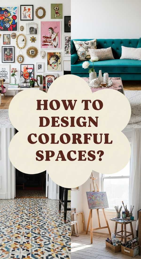
How to Coordinate Interior Color Schemes for Professional Results
[IMAGE_10]
Why we love this
There is a deep satisfaction in a room that ‘works.’ We love professional coordination because it takes the guesswork out of decorating, providing a ‘recipe’ for success. It feels crisp, intentional, and polished. The sensory experience is one of ‘alignment’—everything smells ‘clean’ and looks ‘sharp.’ It gives you the confidence of a pro, ensuring your budget-friendly home looks like it was designed by a high-end firm.
Essential Elements:
- A color wheel tool
- Fabric and paint swatches
- Measuring tape
- The 60-30-10 rule template
- Professional-grade painters tape
How to make it
- Begin with the ’60-30-10 rule’: choose a dominant color for 60% of the room (walls/rugs), a secondary color for 30% (upholstery), and an accent color for 10% (decor).
- Use a color wheel to find ‘complementary’ colors (opposites) for high energy, or ‘analogous’ colors (neighbors) for a more soothing ‘flavor’ profile.
- Test your ‘ingredients’ by placing paint swatches on different walls and observing how the light ‘cooks’ them at different times of the day.
- Coordinate your ‘hardware’ (knobs, rods, frames) to ensure they all share the same metallic ‘undertone,’ which provides a professional ‘finish’ to the space.
- Execute your ‘prep’ work meticulously; use high-quality painters tape for crisp lines, as the ‘plating’ of the room depends on the neatness of the execution.
Conclusion
Transforming your living room into a viral-worthy sanctuary doesn’t require a massive bank account—it just requires a little bit of ‘soul’ and a solid ‘recipe’ for design. Whether you are craving the quiet comfort of a cozy sanctuary or the high-energy ‘zing’ of a vibrant palette, remember that your home is a reflection of your unique journey. By focusing on sensory details, layering textures, and being intentional with your color choices, you can create a space that not only looks incredible on camera but feels even better to live in. Now, go forth and start creating your own masterpiece!