
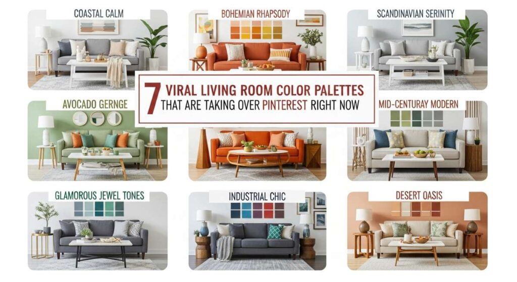
10 Viral Living Room Color Palettes That Are Taking Over Pinterest Right Now
There is a certain magic that happens when you walk into a room and the colors just click. It’s like a deep, satisfying exhale after a long day; a visual hug that tells you you’re exactly where you need to be. We’ve all spent those late nights scrolling through Pinterest, saving pins of sun-drenched velvet sofas and moody accent walls, dreaming of the day our own living rooms feel like those curated sanctuaries. The truth is, color is the heartbeat of your home—it dictates whether you feel energized for a morning coffee or tucked in for a cozy movie night.
This season, the trends are shifting away from the stark, cold greys of the past and moving toward palettes that tell a story. Whether you’re craving the grounding energy of earth tones or the whimsical spark of a vibrant, eclectic mix, the perfect color scheme is out there waiting for you. In this guide, we’re breaking down the most viral living room palettes that are currently dominating our feeds, giving you the exact steps to recreate these designer looks in your own space without the professional price tag.
How to Master Living Room Decor Colors for Endless Comfort

Why we love this
This palette is the interior design equivalent of a cashmere blanket and a warm cup of herbal tea. It relies on deep moss greens, warm oaks, and creamy oatmeal tones that evoke the soothing stillness of a forest floor. When you step into a room styled this way, you can almost smell the faint scent of cedarwood and dried lavender, while the tactile richness of chunky knits and velvet pillows invites you to sink in and stay a while. It’s a sensory experience that prioritizes softness and emotional grounding over rigid structure.
Essential Elements:
- Deep Moss Green velvet sofa
- Natural White Oak coffee table
- Oatmeal-colored wool area rug
- Brass floor lamps for warm lighting
- Terracotta planter accents
How to make it
- Start by applying a base coat of warm, creamy white to your walls to act as a neutral canvas that reflects soft natural light.
- Introduce your primary anchor piece, such as a deep moss green or forest-toned sofa, which provides the visual weight and comfort level of the room.
- Layer in natural textures by choosing a light wood coffee table and a high-pile wool rug in a neutral beige or oatmeal shade.
- Incorporate secondary accent colors through throw pillows in burnt sienna or muted clay to add depth without overwhelming the eye.
- Finish the look with warm-toned metallic accents, like brushed brass or antique gold frames, ensuring your light bulbs are in the 2700K range for a golden, sunset-like glow.
How to Select Room Decor Colors for a Harmonious Home
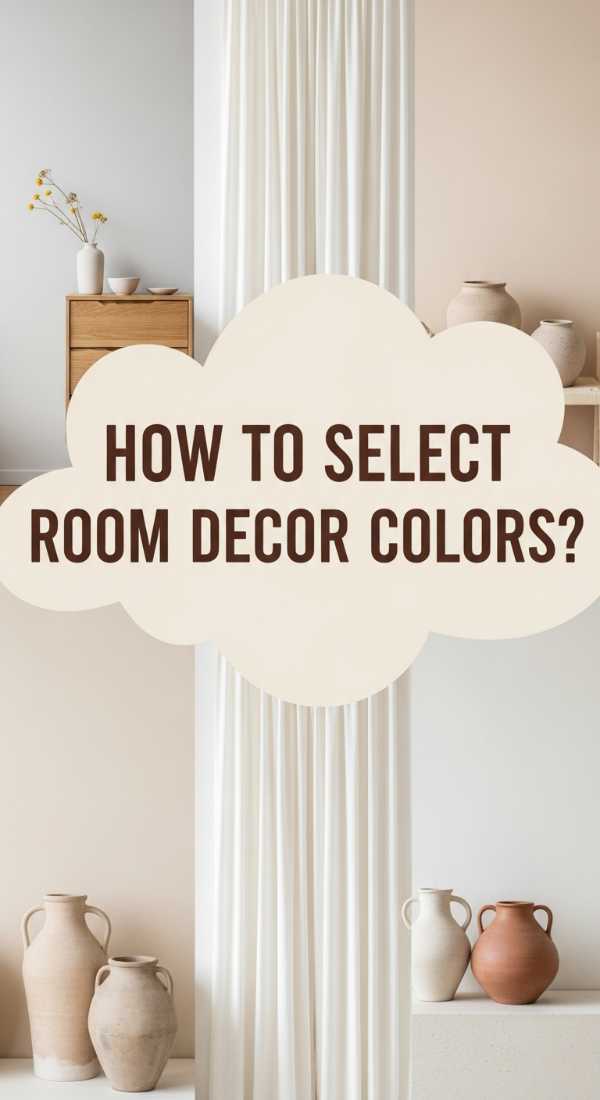
Why we love this
There is a profound sense of peace in a room where colors flow into one another like a watercolor painting. This harmonious approach uses tonal layering—think shades of sand, biscuit, and soft greys—to create a space that feels expansive and light. It’s about the subtle interplay of shadow and highlight, where the texture of a bouclé chair or the grain of a stone table becomes the focal point. This palette feels like a fresh breath of morning air, clean and revitalizing, perfect for those who seek a clutter-free mind.
Essential Elements:
- Layered shades of Greige and Sand
- Bouclé or linen upholstery
- Matte ceramic vases
- Light-filtering linen curtains
- Soft grey limestone accents
How to make it
- Select three varying shades of the same neutral family—for example, a light sand, a medium taupe, and a soft grey—to use as your primary color story.
- Paint the walls in the lightest shade to maximize the sense of space and bounce light across the room.
- Choose furniture that matches the middle tone, ensuring that the fabrics have high texture (like bouclé or heavy linen) to prevent the room from looking flat.
- Add ‘visual weight’ by using the darkest of your three shades for smaller items like curtain rods, picture frames, or a single accent chair.
- Ensure harmony by avoiding high-contrast black; instead, use charcoal or deep espresso as your darkest point to keep the transitions soft and seamless.
How to Use Living Room Decor Color for a Bold Statement
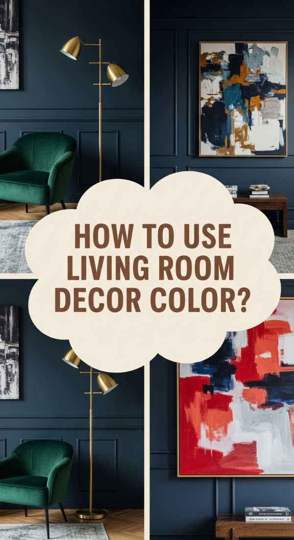
Why we love this
For the brave at heart, this palette is a celebration of drama and sophistication. We love the way a deep navy or a rich charcoal wall can transform a standard living room into a high-end lounge that feels both intimate and expensive. It’s like a visual feast of dark chocolate and midnight velvet; the way candlelight flickers against a dark backdrop creates an atmosphere that is undeniably romantic and bold. It turns the room into an experience, making every evening spent at home feel like a special occasion.
Essential Elements:
- Navy Blue or Charcoal accent wall
- Cognac leather seating
- Gold leaf decorative accents
- Deep-toned botanical prints
- Dark walnut shelving
How to make it
- Identify your focal wall—usually the one behind the sofa or fireplace—and apply a high-quality matte paint in a deep jewel tone like navy or emerald.
- Balance the dark wall by introducing warm leather elements, such as a cognac-colored armchair, which provides a rich contrast and a ‘lived-in’ luxury feel.
- Use metallic gold or copper hardware and lighting fixtures to ‘pierce’ the darkness and add a sense of high-end jewelry to the room.
- Incorporate large-scale art with white matting to break up the dark expanses of the wall and provide a place for the eye to rest.
- Install dimmable overhead lighting and multiple floor lamps to control the mood, ensuring the corners of the room are gently illuminated to avoid a ‘cave’ effect.
How to Curate Room Decor Colorful Vibes for Daily Joy
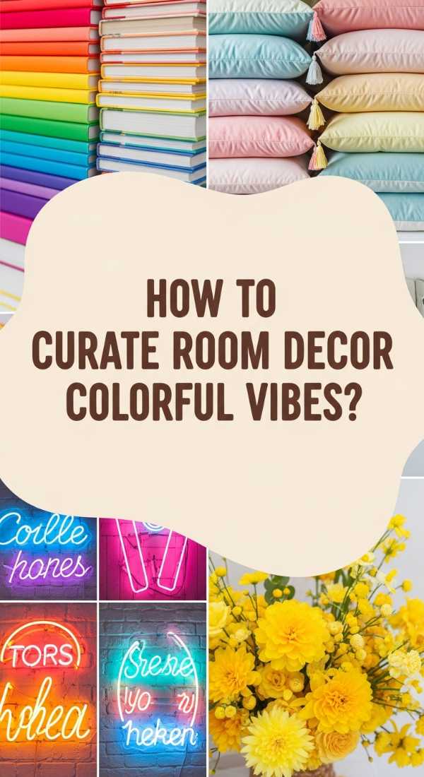
Why we love this
This is the ultimate ‘happy’ palette, filled with the vibrant energy of a summer garden in full bloom. Imagine the zest of lemon yellow paired with the softness of sky blue and the playfulness of coral—it’s a visual shot of espresso for your home. This approach is all about dopamine decor, where every color choice is designed to trigger a smile. The aroma of fresh citrus candles and the sight of bright, eclectic textiles create a space that feels alive, youthful, and infinitely welcoming for friends and family.
Essential Elements:
- Pastel blue walls or rugs
- Citrus yellow accent pillows
- Coral or peach decorative glass
- Multi-colored gallery wall
- Light ash wood furniture
How to make it
- Choose a ‘base’ bright—like a very soft mint or a sky blue—for your largest surface areas to keep the room feeling airy.
- Follow the 60-30-10 rule: 60% neutral/soft base, 30% secondary color (like coral), and 10% bold accent (like bright yellow).
- Mix patterns freely but keep them within the same color family; for example, a striped blue rug paired with a floral blue and yellow cushion.
- Incorporate colorful glass elements like vases or bowls that catch the sunlight and throw beautiful, colorful reflections around the room.
- Keep the flooring and larger furniture pieces in light, natural woods to prevent the bright colors from feeling chaotic or overwhelming.
How to Choose Decor Color Schemes for a Relaxing Sanctuary
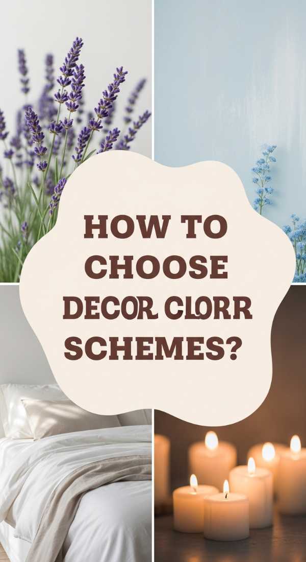
Why we love this
Inspired by the serene tones of the coast, this palette is designed to lower your heart rate the moment you cross the threshold. It’s a delicate balance of misty blues, soft seafoam, and weathered driftwood greys that feel like a quiet morning by the ocean. The texture of soft cotton and the scent of sea salt air come to mind, creating a sanctuary that feels miles away from the hustle of everyday life. It’s clean, sophisticated, and timelessly elegant without ever feeling cold.
Essential Elements:
- Soft Seafoam or Duck Egg Blue textiles
- Bleached wood coffee table
- White slipcovered sofas
- Woven seagrass baskets
- Frosted glass lamps
How to make it
- Opt for a white or very light grey sofa with a slipcover to create a relaxed, ‘coastal villa’ foundation for the room.
- Introduce soft blues through sheer curtains or throw blankets, ensuring the fabric is lightweight and breathable like linen or cotton.
- Incorporate natural fibers like jute or seagrass in your rugs and storage baskets to add an earthy, organic texture that grounds the airy colors.
- Use ‘weathered’ finishes on wooden furniture—look for grey-washed or bleached oaks rather than dark, polished cherries or walnuts.
- Keep the decor minimal; a few pieces of white coral or simple ceramic vessels will maintain the uncluttered, relaxing vibe of a high-end spa.
How to Style Living Room Decor Cozy Elements for Rainy Days

Why we love this
When the rain is lashing against the window, you want a living room that feels like a protective cocoon. This palette leans into the warmth of the hearth, featuring burnt oranges, deep chocolates, and rusty ambers. It’s a rich, sensory feast that feels like woodsmoke and old books. The heaviness of the colors provides a sense of security and warmth, turning your living room into the ultimate retreat for hibernation and reflection. It is rustic, soulful, and deeply comforting.
Essential Elements:
- Burnt Orange or Rust velvet cushions
- Dark chocolate brown leather or wood
- Amber glass candle holders
- Thick wool chunky knits
- Faux fur throws
How to make it
- Layer multiple textures of the same warm hue; for instance, a rust-colored velvet pillow next to a rust-colored chunky knit throw.
- Use ‘low-level’ lighting like table lamps with amber-tinted bulbs to enhance the orange and brown tones in the room.
- Introduce dark wood elements, such as a walnut bookshelf or side table, to provide a sturdy, traditional foundation for the cozy decor.
- Place amber glass vessels near your light sources to create a warm, glowing ‘fireplace’ effect throughout the space even if you don’t have a hearth.
- Add a touch of the outdoors with dried botanicals like pampas grass or eucalyptus, which add a muted, organic texture that fits the rainy-day aesthetic.
How to Find Your Perfect Decor Color for Artistic Expression

Why we love this
This palette is for the curator, the collector, and the dreamer. It’s an unconventional mix of teal, mustard, and magenta that feels like a walk through a contemporary art gallery. We love the way these colors challenge the status quo, offering a vibrant backdrop for self-expression and creativity. It’s a visual melody that feels energetic and sophisticated, where every object tells a story and every color choice is a bold reflection of your unique personality and artistic flair.
Essential Elements:
- Teal or Peacock Blue accent pieces
- Mustard yellow velvet armchairs
- Abstract art with magenta and violet pops
- Terrazzo stone side tables
- Black architectural lighting
How to make it
- Start with a neutral ‘gallery white’ wall to allow your bold color choices to truly pop without competition.
- Choose one ‘hero’ color for a large furniture item, such as a teal sofa or a mustard armchair, to serve as the anchor for your artistic vision.
- Hang large-scale abstract art that contains at least three of your chosen accent colors to tie the entire room’s palette together visually.
- Use black metal accents in your lighting and furniture legs to provide a sharp, modern ‘outline’ that gives the colors structure and definition.
- Don’t be afraid to mix metals; a silver lamp next to a brass tray can enhance the eclectic, curated feel of an artist’s studio.
How to Apply Living Room Decor Color Schemes for Elegant Living

Why we love this
True elegance often lies in the understated, and this champagne and cream palette is the height of luxury. It’s a shimmering, pearlescent world that feels like silk against the skin and expensive perfume in the air. By focusing on varying shades of white, ivory, and soft metallic gold, the room feels incredibly high-end and curated. This is the palette of the ‘quiet luxury’ movement—it doesn’t need to shout to be noticed; its quality and harmony speak volumes.
Essential Elements:
- Champagne-colored silk or satin pillows
- Ivory wool or silk-blend rug
- Polished marble coffee table
- Crystal chandeliers or lamps
- Gilded mirror frames
How to make it
- Paint the walls in a high-quality ‘pure white’ with a satin finish to give a slight glow to the room’s perimeter.
- Invest in a high-quality ivory rug that covers most of the floor space to create a plush, monochromatic foundation.
- Layer in textures of ‘sheen’—think silk curtains, velvet chairs, and polished stone—which reflect light differently and add depth to the white palette.
- Use gold or silver leafing on picture frames and decorative objects to add a ‘jewelry’ effect that elevates the neutral tones.
- Ensure all ‘white’ elements have the same undertone (either all warm or all cool) to prevent the room from looking mismatched or messy.
How to Mix Decor Colors for a Vibrant Atmosphere

Why we love this
There’s an infectious energy in a room that isn’t afraid to play with color. This vibrant mix combines the zest of lime green with the depth of royal purple and the warmth of sunset orange. It’s a sensory explosion that feels like a festive celebration every single day. This palette is perfect for those who love to entertain, as the colors naturally stimulate conversation and movement. It’s eclectic, daring, and full of life, turning your living room into the heartbeat of the home.
Essential Elements:
- Jewel-toned area rug
- Mismatched colorful dining or side chairs
- Brightly patterned throw pillows
- Neon or colored LED accent lighting
- Glossy colorful ceramic decor
How to make it
- Pick a ‘statement rug’ that features multiple bright colors; this will serve as your ‘map’ for the rest of the room’s decor.
- Pull 2-3 colors from the rug and repeat them in different textures throughout the room (e.g., a purple glass vase and a purple velvet pillow).
- Balance the vibrancy with one solid, dark element—like a black coffee table—to give the eye a place to rest amidst the color.
- Use glossy finishes for your colorful accents, such as lacquered trays or ceramic lamps, to make the colors feel even more saturated and bright.
- Add greenery in the form of large leafy plants like a Fiddle Leaf Fig; the natural green acts as a ‘neutral’ that complements every other vibrant color.
How to Discover Room Decor Color Palettes for a Fresh Start
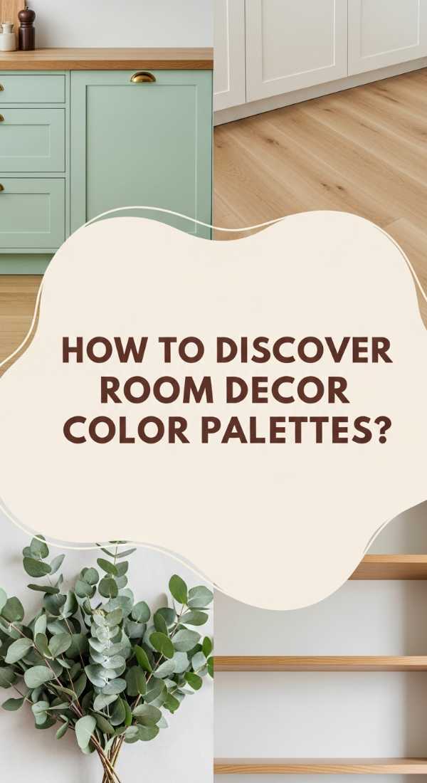
Why we love this
Sometimes we just need a clean slate, and this palette of mint, blush, and crisp white is the ultimate ‘refresh’ button. It’s light, airy, and youthful, feeling like the first day of spring. The softness of the pastels creates a gentle environment that encourages new ideas and a positive outlook. We love how the mint green feels cool and crisp, while the blush pink adds a touch of warmth and softness, making the room feel balanced and incredibly modern.
Essential Elements:
- Mint Green accent wall or chair
- Blush Pink textiles
- Light blonde wood furniture
- Minimalist white shelving
- Fresh flowers and greenery
How to make it
- Choose a very light mint or ‘pistachio’ green for a single accent wall or a set of curtains to introduce a sense of freshness.
- Pair the mint with blush pink accents in soft textures like cotton or mohair to add a sophisticated, feminine touch that isn’t too ‘sugary.’
- Keep all wood furniture in the ‘blonde’ or ‘ash’ family to maintain the light and airy feel of the fresh start aesthetic.
- Use white ceramic or matte white metal for your lighting fixtures to keep the look clean and modern.
- Incorporate plenty of live plants with light green leaves to enhance the ‘natural’ and ‘fresh’ feel of the palette.
Conclusion: Your Home, Your Masterpiece
Choosing a living room color palette is about more than just matching a rug to a sofa; it’s about curating the backdrop for your life’s most precious moments. Whether you lean toward the moody sophistication of navy and gold or the light-filled joy of pastels, your choice should reflect the way you want to feel the moment you walk through your front door. Remember, these viral trends are just a starting point—feel free to mix, match, and break the rules until your living room feels exactly like home. Happy decorating!