
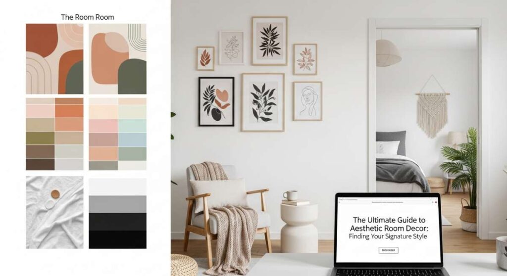
Have you ever walked into a room and felt an instant sense of relief, as if the walls themselves were giving you a warm, familiar hug? We’ve all been there—scrolling through endless Pinterest boards, dreaming of that perfect ‘aesthetic’ that feels uniquely ours. Your home should be more than just a place to sleep; it’s a living, breathing canvas of your personality, a sanctuary where your soul can finally exhale after a long day in the outside world.
Finding your signature style isn’t about following every fleeting trend on social media; it’s about curating a space that resonates with your internal rhythm. Whether you crave the quiet stillness of a minimalist retreat or the vibrant, eclectic energy of a maximalist haven, the secret lies in the harmony of color and texture. Today, we’re diving deep into the art of color palettes to help you transform your four walls into a masterpiece of comfort and style.
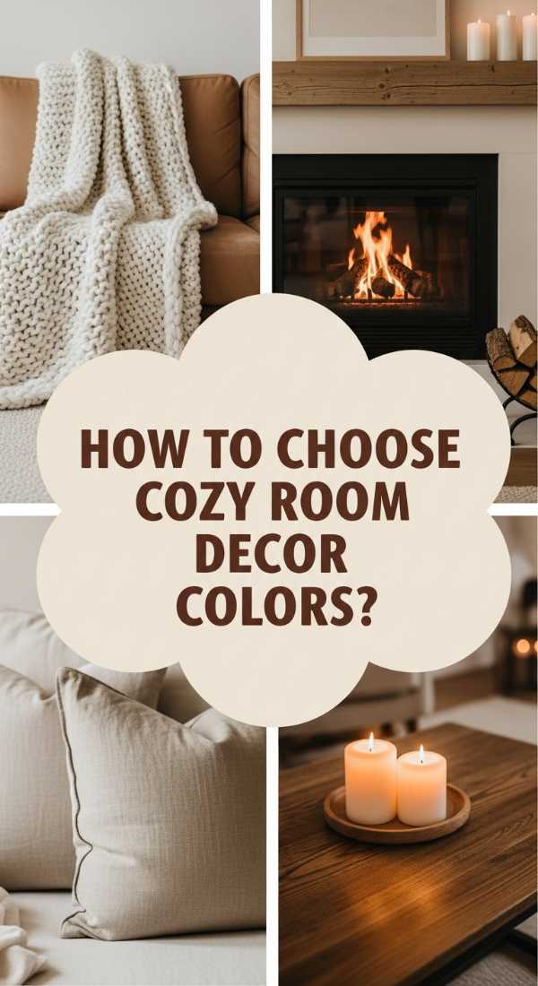
How to Select Living Room Decor Color Schemes for Ultimate Hygge
Why we love this
There is something profoundly soul-soothing about the Hygge aesthetic, which transforms a simple living room into a cocoon of safety and warmth. Imagine the scent of vanilla bean candles wafting through the air while you run your fingers over the nubby texture of a cream-colored wool throw. The visual softness of oatmeal tones and muted taupes creates a low-contrast environment that allows the eyes to rest, reducing visual noise and inviting a deep, meditative sense of calm that feels like a permanent Sunday morning.
Essential Elements:
- Oatmeal and warm-white base tones
- Natural wood accents (light oak or pine)
- Chunky knit wool blankets
- Soft, warm-toned ambient lighting
- Faux fur or sheepskin rugs
How to make it
- Select a base paint with warm yellow or pink undertones rather than cool blue; look for ‘Swiss Coffee’ or ‘Alabaster’ shades.
- Layer your lighting by avoiding the ‘big light’ and placing floor lamps with warm-toned bulbs (2700K) at different heights to create depth and shadows.
- Introduce varied textures in the same color family—mix a linen sofa with wool pillows and a jute rug to prevent the space from looking flat.
- Add ‘life’ elements like a small bowl of dried eucalyptus or a pile of well-worn books to provide organic shapes that break up rigid furniture lines.
- Evaluate the ‘cozy factor’ by sitting in every corner; if a spot feels cold, add a textured textile or a warm-glow candle to ‘heat’ the visual space.
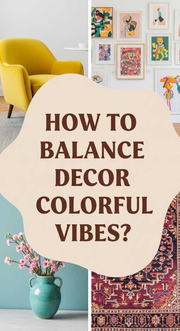
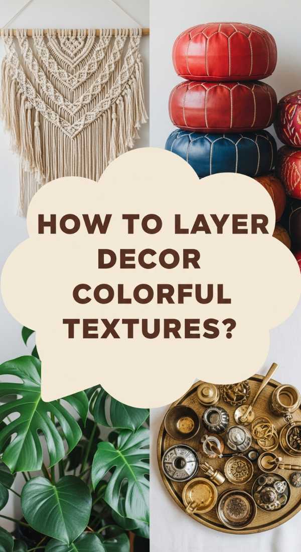
How to Style Decor Colorful Accents for a Joyful Living Space
Why we love this
Injecting vibrant color into your home is like a shot of pure dopamine for your interior design. It’s about the thrill of a cobalt blue vase catching the sunlight or the citrusy zing of a lemon-yellow cushion against a neutral chair. These pops of color act as visual exclamation points, breaking the monotony of daily life and reflecting an adventurous, optimistic spirit that can lift your mood the second you step through the doorway and smell the fresh, zesty aroma of a citrus diffuser.
Essential Elements:
- Neutral gray or white backdrop
- High-saturation accent pieces (teal, mustard, fuchsia)
- Abstract art with bold brushstrokes
- Colorful glassware or ceramics
- Patterned throw pillows
How to make it
- Identify your primary ‘pop’ color and ensure it appears at least three times in the room to create a sense of intentionality rather than randomness.
- Apply the 60-30-10 rule: 60% neutral base, 30% secondary color, and 10% of your bold, joyful accent.
- Use ‘visual bridges’ like a piece of art that contains both your neutral base and your accent color to tie the disparate elements together.
- Balance high-energy colors with clean lines; if you use a bright orange chair, ensure the silhouette is modern and sleek to avoid visual clutter.
- Check the ‘energy’ of the room at noon; if the colors feel overwhelming, pull back one accent piece until the balance feels stimulating but not chaotic.
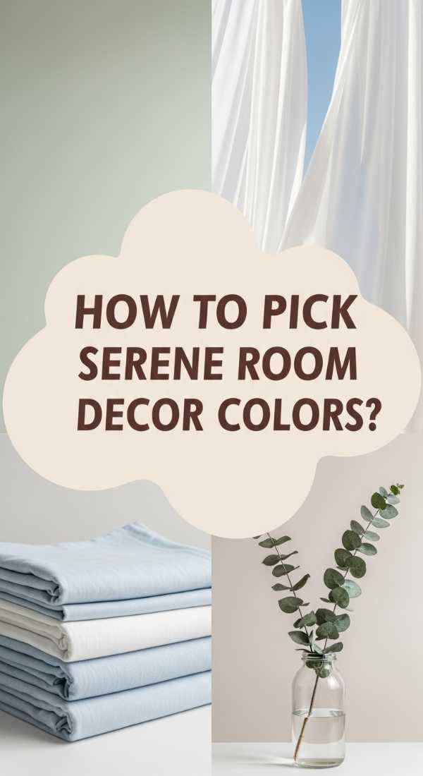
How to Design Room Decor Color Palettes for a Serene Sanctuary
Why we love this
Creating a serene sanctuary is about mimicking the quiet whispers of nature within your own home. We adore the way cool sage greens and misty seafoams mimic the stillness of a forest glade or the rhythmic washing of waves against the shore. The tactile sensation of smooth cotton linens and the faint, earthy scent of lavender create a multisensory experience that lowers the heart rate, turning your bedroom or reading nook into a private island of tranquility far away from the digital buzz.
Essential Elements:
- Sage green, dusty blue, and soft lavender
- Matte finishes (avoiding gloss)
- Natural linen and organic cotton
- Soft, diffused natural light
- Minimalist botanical prints
How to make it
- Choose a ‘recessive’ color for the walls—cool tones like soft blue or green visually recede, making a small room feel more spacious and airy.
- Opt for matte or eggshell paint finishes to prevent light glare, which can be overstimulating to the eyes during daylight hours.
- Layer tonally—use three different shades of the same green for your bedding, pillows, and curtains to create a ‘waterfall’ effect of color.
- Incorporate natural wood with a raw finish; the lack of shiny varnish maintains the organic, grounded feel of the sanctuary.
- Test the ‘serenity’ by removing all electronics and visible plastic; replace them with glass or ceramic to maintain a pure, natural vibration.
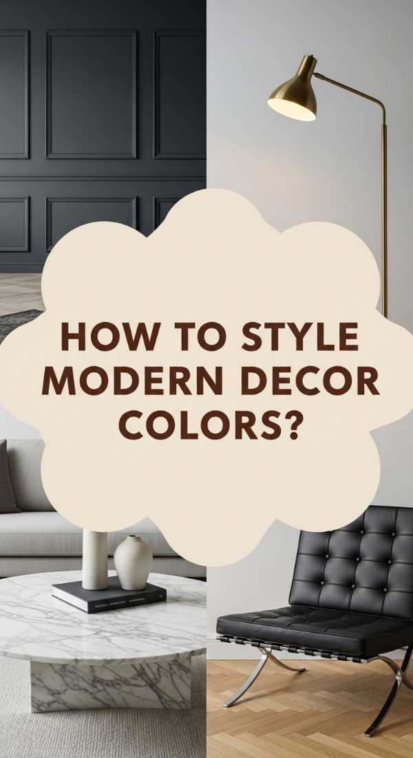
How to Master Living Room Decor Color Tones for Modern Elegance
Why we love this
Modern elegance is all about the sophisticated dance between shadow and light, creating a space that feels curated, expensive, and timeless. We love the weight of a charcoal velvet sofa paired with the glint of brushed gold hardware—it’s a combination that feels like a well-tailored suit. The atmosphere is one of quiet confidence, where every object has a purpose and the air feels crisp, perhaps carrying the faint, woody scent of sandalwood or expensive leather.
Essential Elements:
- Monochromatic base (charcoal, slate, or deep navy)
- Metallic accents (brushed brass or matte black)
- Marble or stone surfaces
- Structured, architectural furniture silhouettes
- Velvet or silk textiles
How to make it
- Establish a high-contrast foundation by pairing very dark elements (like a black accent wall) with very light elements (like a white marble coffee table).
- Introduce ‘metallic highlights’ sparingly; use gold or brass on light fixtures, drawer pulls, or picture frames to act as the room’s jewelry.
- Focus on the ‘finish’ of fabrics—choose heavyweight velvets that catch the light to add a sense of luxury and depth to dark furniture.
- Ensure lines are sharp and clean; avoid ruffles or overly ornate carvings, opting instead for geometric shapes and smooth surfaces.
- Verify the ‘elegance’ by checking the reflection of light; modern elegance relies on a few strategic reflections to create a polished, high-end glow.
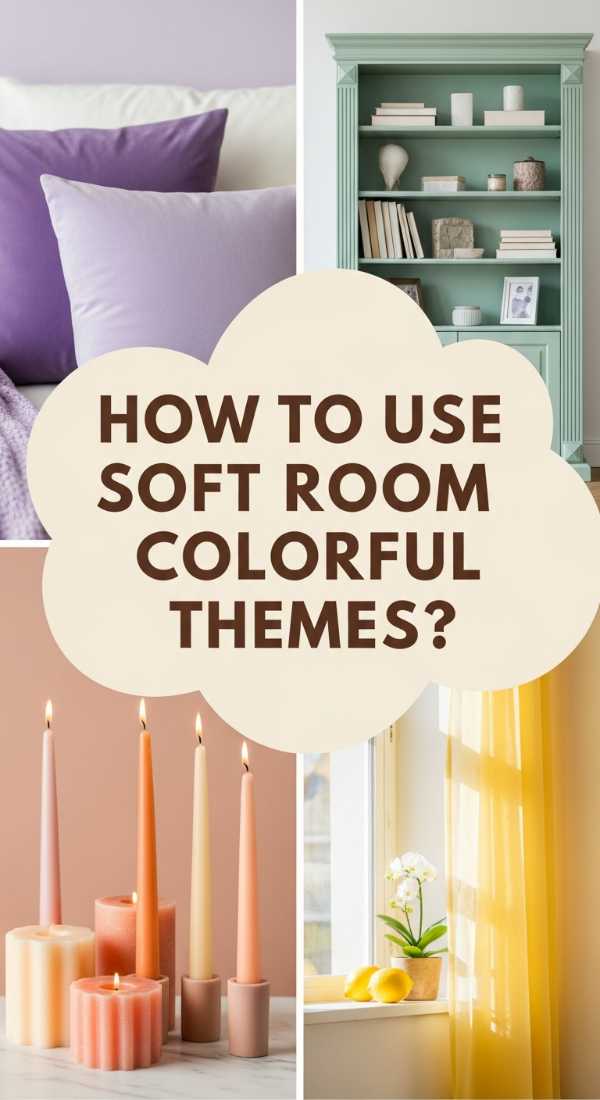
How to Create Room Decor Colorful Energy with Pastel Palettes
Why we love this
Pastels are no longer just for nurseries; they are the secret to creating a space that feels youthful, light, and endlessly refreshing. There is a whimsical joy in the combination of mint green and blush pink that reminds us of springtime blooms and macaron shops in Paris. The aesthetic is soft and airy, like a gentle breeze through a chiffon curtain, providing a sense of weightlessness that makes even the smallest apartments feel like they are filled with light and possibilities.
Essential Elements:
- Blush pink, mint green, and pale lemon
- Light-toned wood or white-washed furniture
- Sheer, flowy window treatments
- Iridescent or glass accessories
- Fresh floral arrangements
How to make it
- Start with a crisp white base for walls and large furniture to allow the pastel colors to ‘float’ rather than looking muddy or childish.
- Mix warm and cool pastels—pair a cool mint with a warm peach to keep the room from feeling too icy or overly ‘sweet.’
- Use ‘frosted’ textures, such as sea glass or matte ceramics, to mimic the soft, diffused look of the pastel color palette.
- Avoid heavy, dark woods; instead, look for birch, ash, or painted white furniture to maintain the ‘airy’ visual weight of the space.
- Measure the ‘sweetness’ of the room; if it feels too much like a candy shop, add one industrial element, like a concrete planter, to ground the design.
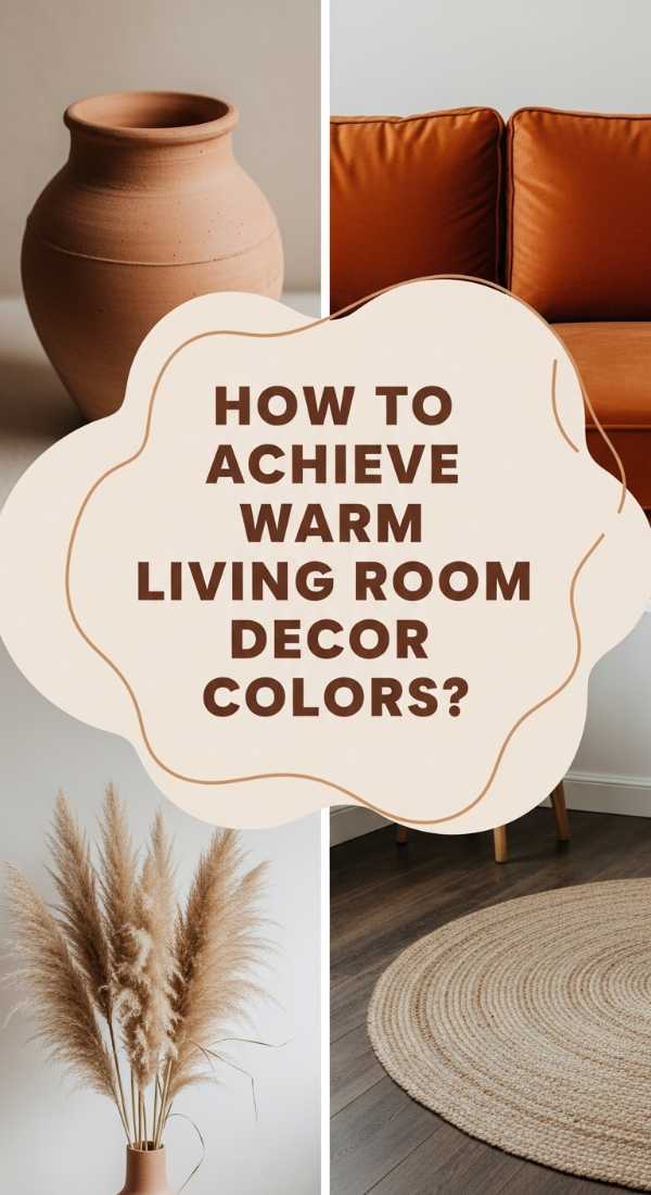
How to Blend Living Room Decor Color Schemes for Autumnal Warmth
Why we love this
Autumnal warmth is about capturing the golden hour and holding it captive in your living room all year round. We are obsessed with the richness of terracotta, burnt orange, and deep mustard—colors that practically radiate heat. When you walk into an autumn-inspired room, you can almost smell the woodsmoke and cinnamon. It’s a grounded, earthy aesthetic that uses heavy textures like corduroy and weathered leather to make you feel completely supported and ‘tucked in.’
Essential Elements:
- Terracotta, rust, and mustard yellow
- Cognac leather or weathered wood
- Heavyweight textiles (wool, corduroy, tweed)
- Dried botanicals and pampas grass
- Copper or bronze hardware
How to make it
- Apply an earthy ‘anchor’ by using a large area rug in a deep rust or clay tone to pull the focus downward and ground the seating area.
- Layer ‘harvest’ colors in varying saturations—use a muted mustard throw over a vibrant terracotta chair for a sophisticated, tonal look.
- Incorporate organic materials like wicker baskets and wooden bowls to reinforce the ‘natural’ feel of the autumnal palette.
- Switch out cool-toned metals for copper or bronze, which naturally complement the orange and red undertones of the room.
- Gauge the ‘warmth’ by light levels; these colors look best under soft, amber-toned light (2200K) which enhances the richness of the red and orange pigments.
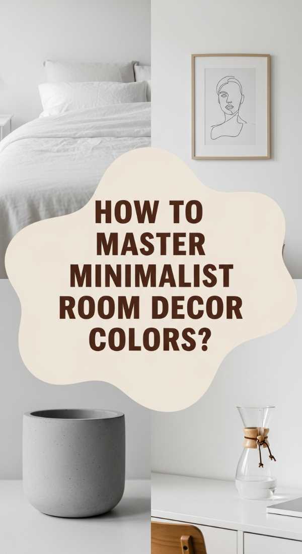
How to Curate Room Decor Colors for a Minimalist Lifestyle
Why we love this
Minimalism is the ultimate palette cleanser for a cluttered mind. We love the radical simplicity of a monochrome space where every object is forced to stand on its own merit. The aesthetic is clean, sharp, and incredibly intentional, often featuring a stark white backdrop that makes the morning sun look like liquid silver pouring over the floor. It creates an atmosphere of ‘visual silence,’ allowing you to focus on the textures of a smooth stone vase or the grain of a solid oak table.
Essential Elements:
- Strict monochrome palette (white, black, and gray)
- Single-species wood accents
- Hidden storage solutions
- High-quality, ‘hero’ furniture pieces
- Large-scale, simple artwork
How to make it
- Commit to a ‘no-color’ policy, focusing instead on the ‘achromatic’ scale from pure white to deep pitch black.
- Prioritize ‘negative space’—ensure that for every piece of furniture, there is an equal amount of empty floor or wall space to allow the room to breathe.
- Select furniture with a ‘hidden’ profile, such as handle-less cabinets and low-slung sofas, to maintain a continuous visual line.
- Use one ‘hero’ texture per room, such as a large concrete fireplace or a single velvet chair, to provide a focal point without adding color.
- Check the ‘clarity’ of the space daily; remove any item that doesn’t serve a functional purpose or bring intense aesthetic value to maintain the minimalist rigor.
How to Choose Living Room Decor Colorful Fabrics for Bohemian Style
Why we love this
Bohemian style is a love letter to the world traveler and the free spirit. We love the ‘more is more’ philosophy that allows you to mix a vintage Persian rug with emerald green velvet pillows and hand-woven macramé. It’s a sensory explosion where you might smell sandalwood incense and feel the tickle of a silk fringe against your skin. The colors are deep, jewel-toned, and storied, creating a space that feels like it has been collected over a lifetime of adventures.
Essential Elements:
- Jewel tones (emerald, ruby, sapphire)
- Mixed patterns (floral, geometric, tribal)
- Fringe, tassels, and embroidery
- Layered rugs and floor cushions
- Abundant indoor greenery
How to make it
- Start with the ‘anchor’ rug—choose a multi-colored vintage or Turkish rug and pull three key colors from its pattern to use in your pillows and drapes.
- Layer fabrics of different weights; drape a light silk scarf over a heavy velvet sofa to create the characteristic ‘effortless’ Boho look.
- Introduce ‘global’ textures like carved wood panels, hammered brass trays, and woven wall hangings to add cultural depth.
- Don’t be afraid to clash patterns; as long as they share one common color, a floral and a stripe can live together in Bohemian harmony.
- Evaluate the ‘life’ of the room by adding plants at every height—hanging pothos, floor-standing fiddles, and shelf-dwelling succulents are non-negotiable.
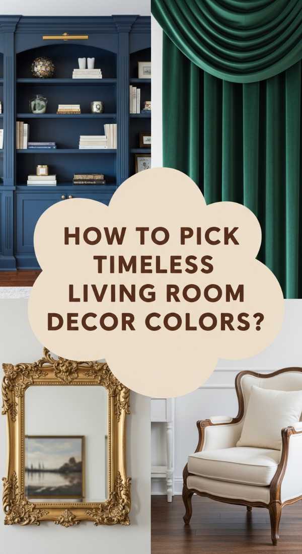
How to Identify Living Room Decor Color Trends for a Timeless Look
Why we love this
There is a quiet power in a room that never goes out of style. Timeless decor avoids the ‘high-sugar’ trends in favor of a classic, ‘slow-burn’ aesthetic that feels as relevant today as it did twenty years ago. We love the stability of navy blue paired with crisp cream and dark walnut. It’s a look that suggests heritage and quality, where the air feels steady and the furniture feels permanent, providing a reliable backdrop for all of life’s changing seasons.
Essential Elements:
- Classic navy, forest green, and creamy beige
- Dark hardwoods (walnut or cherry)
- Traditional silhouettes (Chesterfield sofas, wingback chairs)
- Brass or pewter hardware
- Symmetrical furniture layouts
How to make it
- Select ‘historical’ colors—shades that have been used in interior design for centuries, like ‘British Racing Green’ or ‘Naval Blue.’
- Avoid ‘trendy’ finishes like rose gold or neon; stick to classic metals like polished brass or antique pewter that age gracefully.
- Invest in ‘anchor’ pieces made of solid natural materials—a solid wood dining table or a 100% leather sofa will never look dated.
- Use symmetry to create a sense of order; pair matching lamps on a sideboard or matching chairs across from a sofa.
- Check the ‘longevity’ of your choices by asking: ‘Will I still love this color in ten years?’ If the answer is a hesitation, opt for a more neutral version.
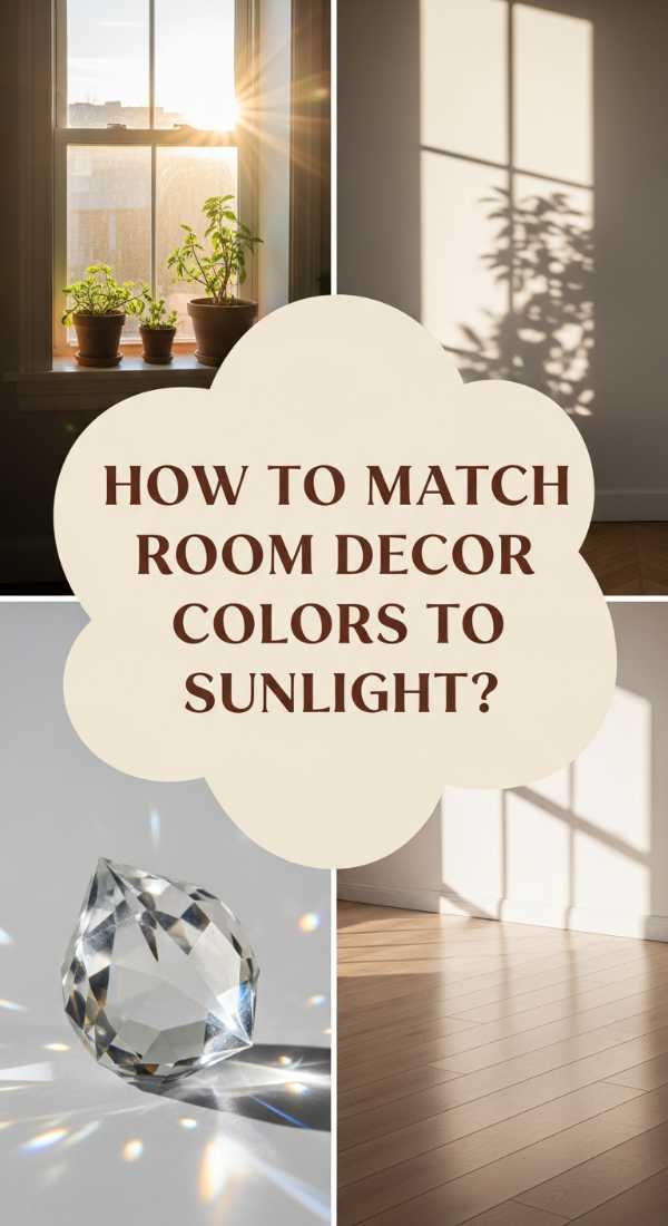
How to Harmonize Room Decor Color Palettes with Natural Light
Why we love this
Natural light is the most important ‘paint color’ in your home, and harmonizing your decor with it is pure magic. We love the way a sun-drenched, south-facing room can make cool grays look warm and inviting, or how a north-facing room can turn a simple white into a soft, ethereal lavender. When you align your palette with the sun’s path, your home feels in sync with the universe, glowing with a radiant energy that changes beautifully from the first light of dawn to the golden glow of sunset.
Essential Elements:
- Light-reflective paint (high LRV – Light Reflectance Value)
- Strategically placed mirrors
- Sheer linen window coverings
- Prisms or crystal accents
- Gloss or satin furniture finishes
How to make it
- Determine the ‘direction’ of your room’s light; North-facing rooms need warm colors (pinks, yellows) to counter cool blue light, while South-facing rooms can handle cool colors (blues, greens).
- Use ‘bouncing’ techniques—place a large mirror directly opposite your main window to double the amount of natural light in the space.
- Choose paint with a high LRV (above 60) for dark rooms to ensure that every photon of light is reflected back into the living area.
- Opt for sheer window treatments that ‘filter’ light rather than blocking it, creating a soft, glowing atmosphere even when the curtains are closed.
- Observe the ‘color shift’ at different times of day; paint large swatches on every wall and watch them for 24 hours before committing to a final shade.
Designing Your Personal Haven
Your home is a reflection of your journey, and finding your signature style is a beautiful process of self-discovery. By mastering these color palettes and design techniques, you’re not just decorating a room; you’re crafting a backdrop for your life’s most precious moments. Remember, there are no hard rules in design—only guidelines to help you find what makes your heart feel at home. So, grab a paintbrush, layer those textures, and start creating the aesthetic sanctuary you’ve always dreamed of.