
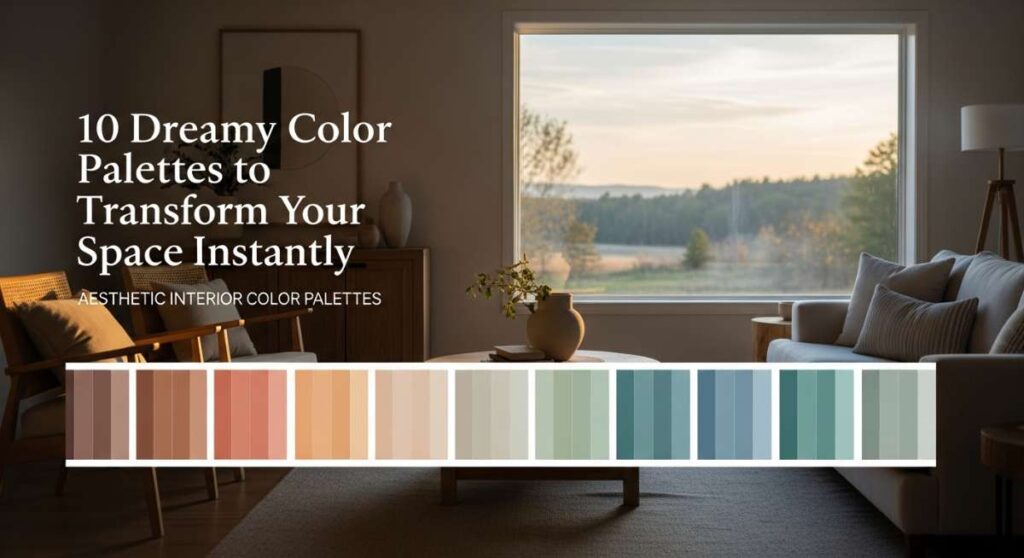
10 Dreamy Color Palettes to Transform Your Space Instantly
Have you ever walked into a room and felt an immediate sense of relief, like the walls themselves were giving you a warm, soft hug? We spend so much of our lives inside our homes, yet we often overlook the visceral, emotional power that a simple change in color can provide. It’s more than just paint on a wall; it’s the atmosphere that greets you after a long day, the backdrop to your morning coffee, and the sanctuary where you dream.
Today, we’re diving deep into the art of the aesthetic interior. Whether you’re craving a serene sanctuary to escape the chaos or a vibrant, joyful hub that sparks creativity, these ten curated palettes are designed to transform your living space into a reflection of your soul. Let’s explore how these hues can breathe new life into your home, one brushstroke at a time.
How to Choose Living Room Decor Colors for a Cozy Haven
Why we love this
There is something fundamentally soothing about the pairing of toasted oatmeal and honeyed amber. This palette evokes the sensory delight of a sun-drenched afternoon spent curled up with a cashmere throw, the air smelling faintly of vanilla bean and aged cedarwood. The textures feel soft and inviting, turning even the coldest room into a warm, glowing embrace that invites you to linger just a little bit longer. It creates a tactile experience where every surface feels smooth, organic, and deeply grounded in comfort.
Essential Elements:
- Warm Oatmeal base paint
- Honey-toned wood furniture
- Creamy wool or boucle textiles
- Amber glass candle holders
- Soft, diffused warm lighting
How to make it
- Begin by prepping your walls with a high-quality matte primer to ensure the oatmeal base appears velvety and uniform under various lighting conditions.
- Apply the base color using a medium-nap roller, working in ‘W’ patterns to avoid streaks; allow at least 4 hours of drying time before assessing the depth of the hue.
- Introduce your honey accents through natural oak or walnut furniture pieces, ensuring the wood grain is visible to add organic texture to the visual landscape.
- Layer your textiles starting with a large, neutral rug, then move to the sofa, adding chunky knit pillows and throws that incorporate varying shades of beige and cream.
- Finalize the look by placing amber glass accessories near windows or lamps, where the light can catch the warmth and distribute a golden glow throughout the room.
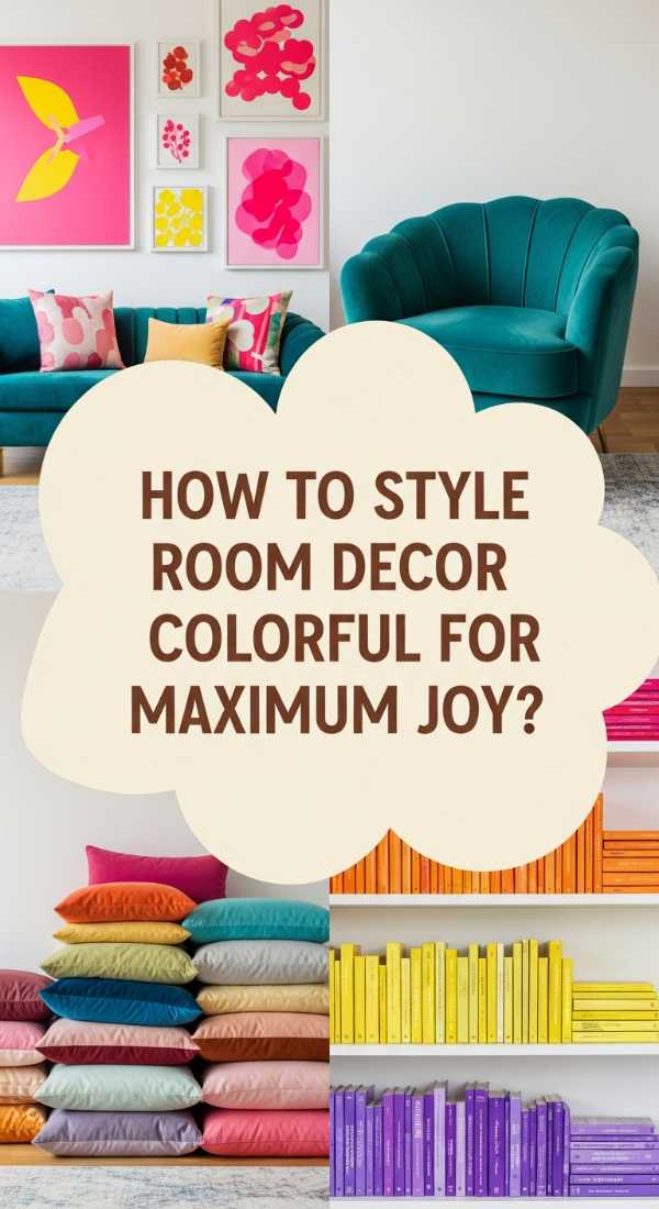
How to Style Room Decor Colorful for Maximum Joy
Why we love this
This palette is an absolute explosion of happiness, combining electric citrus yellow with deep, refreshing teal. It feels like a burst of summer energy, reminiscent of a crisp lime sorbet or the vibrant turquoise of a tropical lagoon. The aroma of citrus zest and fresh sea salt seems to linger in the air when you occupy a space this lively, instantly lifting your mood and sparking a sense of playful creativity. It is bold, unapologetic, and designed for those who want their home to be a constant source of inspiration.
Essential Elements:
- Bright Lemon Yellow accents
- Deep Teal focal wall or sofa
- Crisp White trim for contrast
- Abstract colorful artwork
- Glossy ceramic finishes
How to make it
- Identify a focal point, such as a main wall or a large piece of furniture like a velvet sofa, and apply a rich, saturated teal to anchor the space.
- Balance the intensity of the teal by painting the surrounding walls a crisp, reflective white, which prevents the room from feeling closed in or overly dark.
- Introduce ‘pops’ of citrus yellow through smaller decor items like throw pillows, vases, or a statement armchair to draw the eye around the room.
- Incorporate high-gloss finishes on side tables or decorative bowls to reflect light and enhance the ‘jewelry’ effect of the vibrant colors.
- Monitor the visual weight by ensuring the teal occupies roughly 30% of the room, the yellow 10%, and the neutral white 60% for a professional, balanced distribution.
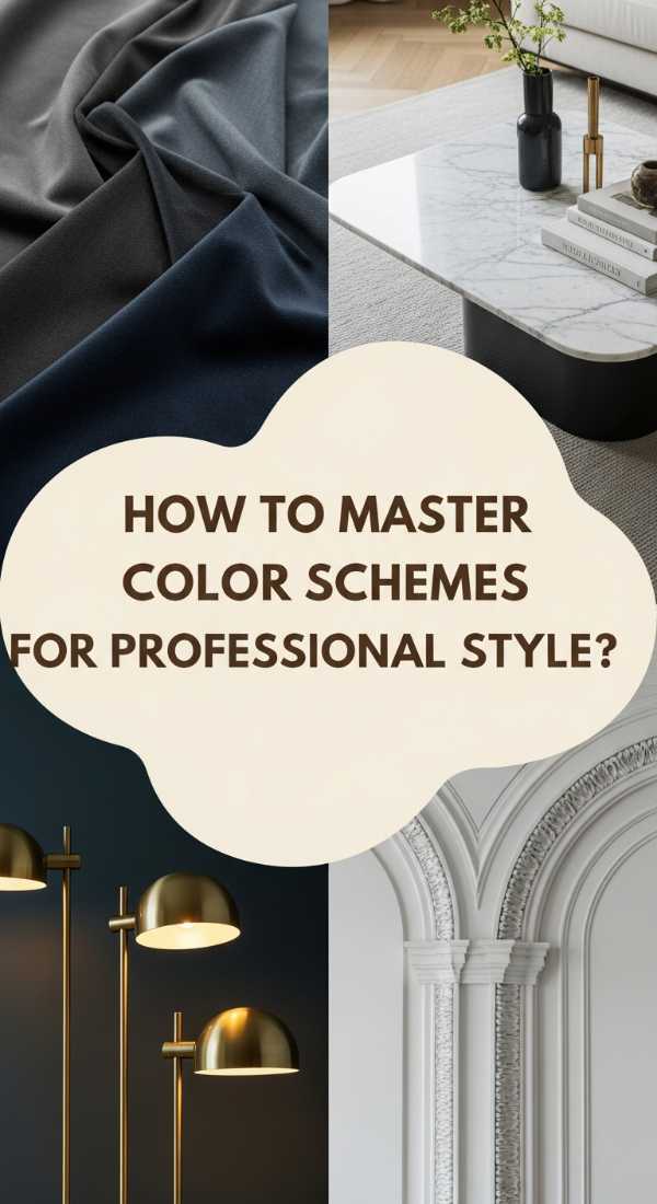
How to Master Living Room Decor Color Schemes for Professional Style
Why we love this
For those who crave a sophisticated, executive feel, the combination of charcoal grey, navy blue, and brushed brass is the ultimate power move. It carries the weight of a high-end studio, smelling of expensive leather and polished mahogany, while offering a cool, composed atmosphere. The sensory experience is one of refined smoothness—think silk-blend curtains and heavy metal accents that feel cool to the touch but look incredibly warm under the evening light. It’s a palette that commands respect and provides a steadying influence on the mind.
Essential Elements:
- Charcoal Grey textured wallpaper
- Navy Blue upholstery
- Brushed Brass hardware and frames
- Dark stained wood flooring
- Architectural lighting fixtures
How to make it
- Apply a textured charcoal wallpaper or a faux-finish paint to your primary wall to create immediate depth and a sense of architectural permanence.
- Select a navy blue sofa or a set of armchairs in a heavy-weight fabric like denim or velvet to provide a luxurious, deep-seated comfort.
- Swap out standard drawer pulls, door handles, and light switches for brushed brass alternatives to introduce a consistent metallic theme throughout the room.
- Install a dark wood floor—or use a large charcoal rug—to ground the space and prevent the navy elements from appearing to float.
- Use ‘cool white’ LED bulbs in your brass fixtures to highlight the crisp lines of the professional aesthetic and accentuate the metallic sheen.
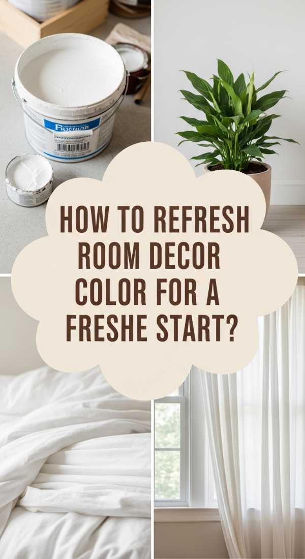
How to Refresh Room Decor Color for a Fresh Start
Why we love this
Sometimes we just need a clean slate, and nothing provides a fresh start like the pairing of crisp white and eucalyptus green. This palette feels like a deep breath in an alpine forest, carrying the sharp, clean scent of crushed leaves and rain-washed stone. The texture is light and airy, emphasizing linen fabrics and matte finishes that don’t hold onto dust or clutter. It’s a rejuvenating experience for the senses, making your living room feel twice as large and infinitely more peaceful, as if the walls themselves are exhaling.
Essential Elements:
- Pristine White wall paint
- Eucalyptus or Sage green accents
- Natural linen curtains
- Light blonde wood accents
- Living indoor plants
How to make it
- Paint all walls and ceilings in a single shade of high-reflectance white to maximize natural light and eliminate visual boundaries.
- Introduce the eucalyptus green through organic elements, such as a collection of potted plants (pothos, eucalyptus branches, or ferns) of varying heights.
- Hang floor-to-ceiling linen curtains in a soft off-white to soften the light entering the room without blocking the refreshing view.
- Select furniture made of light-colored woods like birch or ash to maintain the airy, weightless feel of the refreshing palette.
- Add green accents sparingly—perhaps a single throw or a ceramic vase—to ensure the green feels like a natural extension of the outdoors rather than a heavy color block.
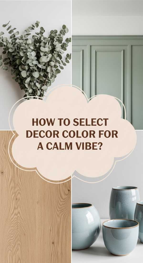
How to Select Living Room Decor Color for a Calm Vibe
Why we love this
Creating a calm vibe requires a palette that doesn’t compete for your attention, such as soft sage and weathered stone. This combination feels incredibly tactile, like the smooth surface of a river rock or the velvet-soft leaves of a garden herb. It carries a subtle, earthy aroma of wet clay and moss, grounding your energy the moment you step inside. The visual transitions are seamless and gentle on the eyes, making it the perfect environment for meditation, reading, or simply decompressing after a high-stimulus day at work.
Essential Elements:
- Muted Sage Green walls
- Stone-colored stoneware and pottery
- Jute or Sisal natural rugs
- Matte grey textiles
- Soft, indirect lamps
How to make it
- Choose a muted sage paint with grey undertones to avoid the color looking too ‘minty’ or youthful; apply two thin coats for a soft, cloudy finish.
- Incorporate ‘stone’ elements through large-scale ceramics or a stone-topped coffee table to provide a sturdy, permanent feel to the decor.
- Layer a jute rug over hardwood or tile to introduce a coarse, natural texture that contrasts beautifully with the soft wall color.
- Select throw pillows in shades of pebble and charcoal to create a monochromatic gradient that is easy for the brain to process.
- Opt for low-wattage, warm-toned bulbs and place them at eye level (on side tables) rather than using overhead lights to maintain the tranquil atmosphere.
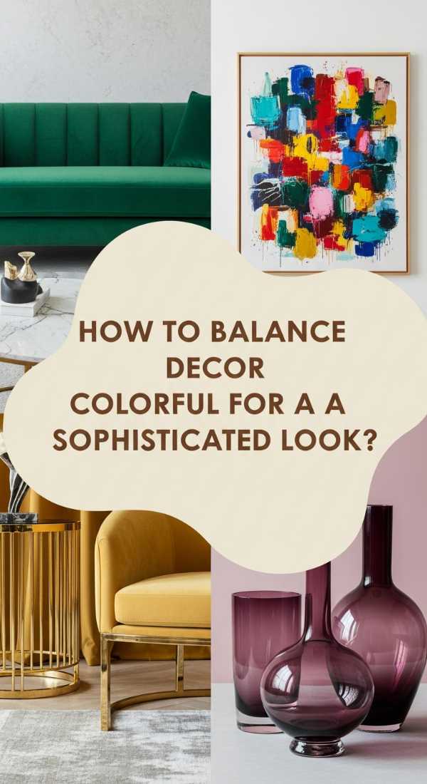
How to Balance Decor Colorful for a Sophisticated Look

Why we love this
Sophistication meets drama in this palette of dusty mauve, deep burgundy, and antique gold. It feels like a vintage Parisian apartment, filled with the scent of old books and dried roses. The textures are rich and heavy—velvets that catch the light, and gilded frames that add a touch of historical grandeur. This isn’t just a room; it’s a mood. It provides a luxurious sanctuary that feels both feminine and powerful, offering a sensory richness that makes every evening feel like a special occasion.
Essential Elements:
- Dusty Mauve wall color
- Deep Burgundy velvet upholstery
- Antique Gold picture frames
- Ornate crown molding
- Dark floral patterns
How to make it
- Apply the dusty mauve paint to the walls, ensuring you include the trim and baseboards for a modern, ‘color-drenched’ sophisticated look.
- Place a statement piece of furniture, such as a burgundy velvet chesterfield sofa, in the center of the room to serve as the sophisticated anchor.
- Curate a gallery wall using exclusively antique gold frames of different sizes to add a sense of curated history and metallic warmth.
- Introduce a dark, moody floral rug or wallpaper panel to tie the mauve and burgundy together through a cohesive pattern.
- Use ‘warm’ spotlighting to highlight the gold accents, creating a shimmering effect that elevates the room’s perceived value.
How to Use Decor Colors for a Luxe Interior
Why we love this
Nothing screams luxury quite like emerald green paired with matte black and shimmering crystal. This palette is the interior design equivalent of a black-tie gala, smelling of expensive perfume and fresh-cut lilies. The emerald provides a lush, verdant depth that feels incredibly expensive, while the black accents provide a sharp, modern edge. Walking into this space feels like stepping into a high-end jewelry box, where every surface is polished to perfection and the overall vibe is one of absolute opulence and exclusivity.
Essential Elements:
- Deep Emerald Green accent wall
- Matte Black metal furniture legs
- Crystal chandeliers or lamps
- High-gloss black floors or rugs
- Silver or Chrome detailing
How to make it
- Select the most prominent wall for a deep emerald green paint, ideally in a satin finish to allow for a slight, luxurious sheen.
- Incorporate matte black through linear elements like bookshelf frames, coffee table legs, or picture frames to provide a crisp, modern structure.
- Hang a crystal light fixture or place crystal decanters on a bar cart to catch and refract light, adding that essential ‘sparkle’ factor.
- Use silk or high-sheen synthetic rugs in black or dark grey to mimic the look of polished stone underfoot.
- Limit your metallic accents to either silver or chrome to maintain a ‘cool’ luxury vibe that contrasts sharply with the warmth of the emerald.
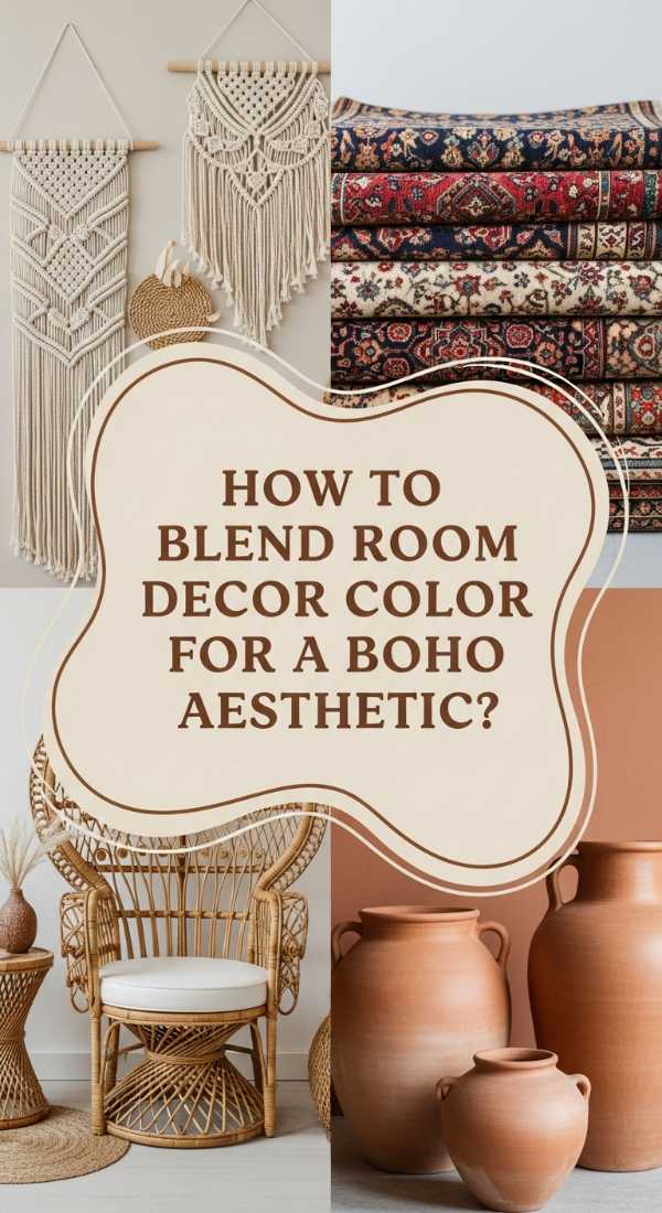
How to Blend Room Decor Color for a Boho Aesthetic
Why we love this
The boho aesthetic is all about warmth and wanderlust, achieved perfectly through a blend of terracotta and mustard yellow. This palette feels like a sunset in the desert, smelling of sagebrush, toasted spices, and sun-warmed earth. The textures are incredibly diverse—fringe, macramé, and distressed wood—providing a tactile playground that feels lived-in and loved. It is a soulful, eclectic combination that encourages relaxation and storytelling, making your home feel like a collection of memories from around the world.
Essential Elements:
- Terracotta clay pots and wall tones
- Mustard Yellow textiles
- Macramé wall hangings
- Woven rattan furniture
- Distressed vintage rugs
How to make it
- Apply a terracotta-hued wash to the walls, or use large terracotta planters to introduce the earthy, reddish-orange base color.
- Layer in mustard yellow through various textures, such as a fringed throw blanket or velvet floor cushions for a cozy, casual seating area.
- Incorporate natural fibers through rattan chairs or a large seagrass basket, which adds the necessary ‘global’ texture for a boho look.
- Hang macramé or woven tapestries to soften the lines of the room and provide a handcrafted, artisanal feel.
- Mix and match patterns in your rugs and pillows, ensuring at least one color (either the mustard or the terracotta) is present in every piece to maintain a sense of intentionality.
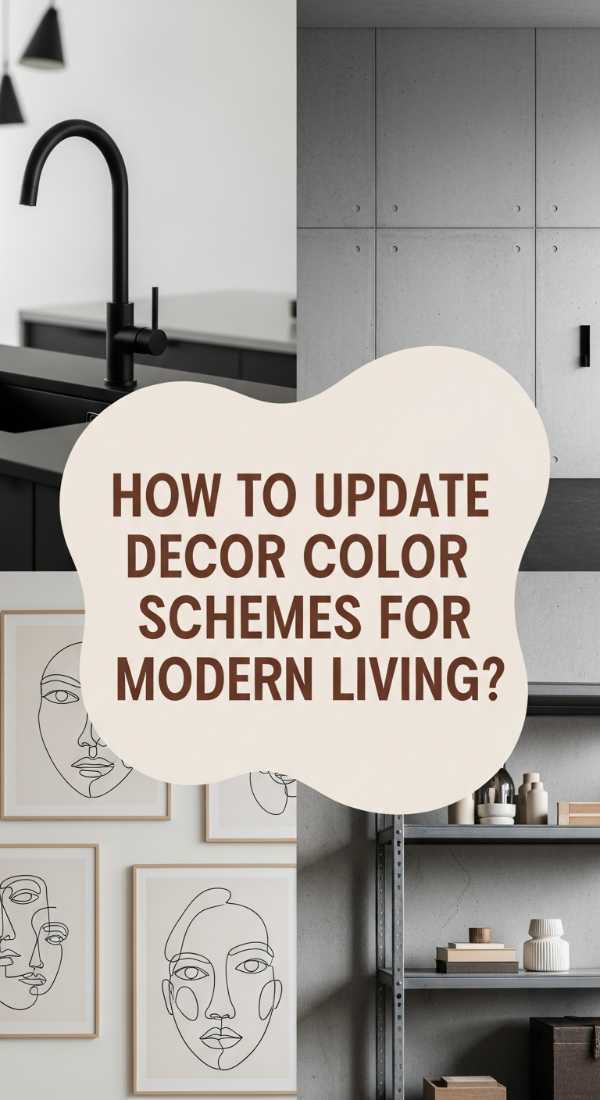
How to Update Living Room Decor Color Schemes for Modern Living

Why we love this
Modern living demands a palette that is both functional and beautiful, which is why ‘greige’ (the perfect mix of grey and beige) paired with matte black is so popular. This palette feels incredibly balanced—neither too cold nor too warm—reminding one of clean linen and smooth concrete. It provides a minimalist sensory experience where the absence of ‘noise’ allows you to focus and breathe. The matte black accents act like ink on paper, providing sharp, graphic lines that make the space feel contemporary, organized, and effortlessly chic.
Essential Elements:
- Warm Greige wall paint
- Matte Black hardware and lighting
- Simple, clean-lined furniture
- Monochrome photography
- Concrete or stone accessories
How to make it
- Paint the entire space in a balanced greige; test samples at different times of day to ensure it doesn’t turn too yellow or too blue in your specific light.
- Introduce matte black through ‘line work,’ such as thin-framed windows, slim floor lamps, or black metal chair legs.
- Keep the furniture silhouettes simple and geometric to emphasize the modern, uncluttered philosophy of the design.
- Decorate with concrete-poured vases or stone coasters to add a ‘raw’ architectural element that complements the greige walls.
- Use large-scale monochrome art with wide white matting to give the room a gallery-like, professional finish.
How to Coordinate Room Decor Colorful Accents for Harmony
[IMAGE_10]
Why we love this
For those who love color but fear chaos, coordinating pastel rainbow accents is the key to a harmonious, joyful home. Imagine the soft, powdery scent of marshmallows and the gentle feeling of a watercolor painting coming to life. This palette uses desaturated shades of lavender, mint, peach, and baby blue to create a space that feels whimsical yet organized. It’s a sensory delight that feels light, youthful, and incredibly balanced, proving that you can use every color of the rainbow without overwhelming the senses.
Essential Elements:
- White or Light Grey base
- Multi-colored pastel throw pillows
- Mint green or peach side chairs
- Rainbow-sorted bookshelves
- Soft, multi-tonal rugs
How to make it
- Establish a neutral white base to act as a blank canvas, allowing the pastel colors to stand out without competing with a wall hue.
- Select three to four pastel shades (e.g., mint, lavender, and peach) and repeat them at least three times throughout the room to create a rhythm.
- Organize your bookshelf by color to create a ‘gradient’ effect that serves as a massive piece of coordinated rainbow art.
- Use a multi-tonal rug that incorporates all your chosen pastel shades to ‘stitch’ the different areas of the room together visually.
- Ensure all pastel accents share the same ‘tonal weight’ (saturation level) so that no single color dominates or looks out of place.
Transforming Your Space: The Final Brushstroke
Color is the most powerful tool in your design arsenal. It has the ability to shift your mood, improve your sleep, and even inspire your next great idea. By choosing a palette that resonates with your personal energy—whether it’s the Luxe Emerald of a high-end suite or the Cozy Oatmeal of a rustic cabin—you are doing more than decorating. You are crafting an experience. Don’t be afraid to experiment, layer textures, and most importantly, listen to how a color makes you feel. Your dream home is only a palette away.